drawing, print, etching, paper
#
portrait
#
drawing
# print
#
pen sketch
#
etching
#
pencil sketch
#
figuration
#
paper
#
line
#
genre-painting
#
realism
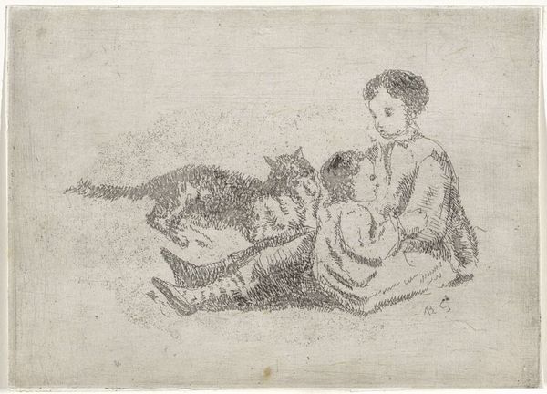
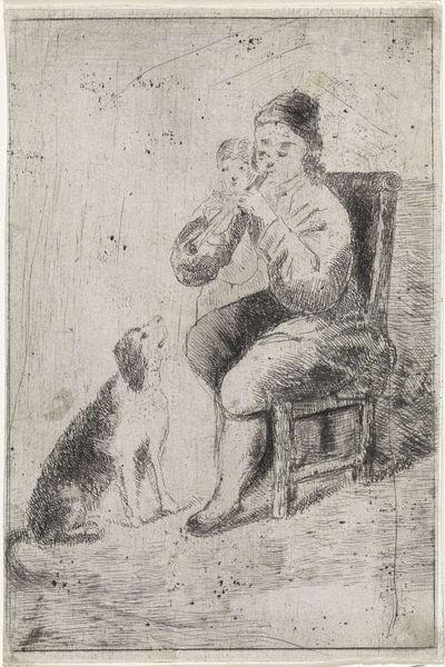
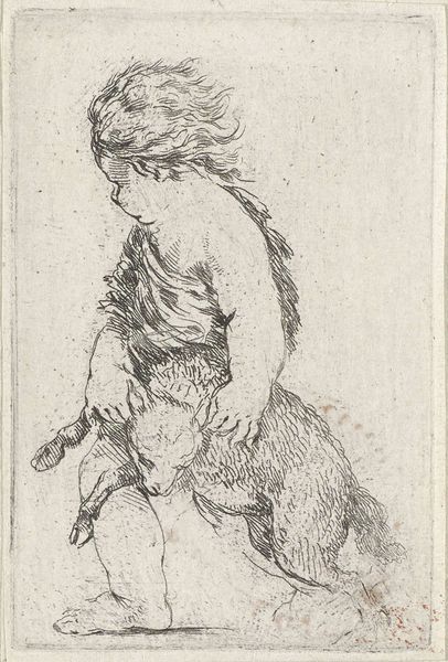
Dimensions: height 152 mm, width 107 mm
Copyright: Rijks Museum: Open Domain
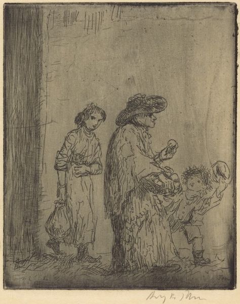
Editor: This etching, "Twee jongens met een geit" by Arnoud Schaepkens, was created sometime between 1831 and 1904. It's got this delicate, almost scribbly quality that I find rather charming. What strikes you most about its visual elements? Curator: The stark contrast of the etching is immediately apparent. Notice the artist’s confident use of line to define form and texture. The composition directs the eye towards the centrally placed children and the accompanying goat. Editor: It's interesting how the lines create so much detail. The figures are almost fuzzy. Curator: Indeed, and consider the relationship between figure and ground. The background is minimal, putting emphasis squarely on the interaction among the children and animal. Note the varying densities of lines used to suggest depth and volume. It begs the question: how does this contribute to the artwork's overall effect? Editor: It definitely makes the children and goat stand out, almost as if they are caught in a moment. Curator: Precisely. The formal choices heighten the immediacy. One must acknowledge the use of a monochromatic palette. How does this restraint in color contribute to the expressive power of the image? Editor: Well, without color, you really focus on the shapes and the way the lines interact with each other, creating a different sort of depth and feel. Curator: An astute observation. It pushes the viewer toward appreciating the more abstract qualities inherent in Schaepkens' mark-making. Editor: Seeing how you dissect the line and composition, I will definitely be looking for that more in other works! Curator: And I find your reaction a compelling reason to reconsider my understanding of "fuzzy" versus the artist’s control of the medium!
Comments
No comments
Be the first to comment and join the conversation on the ultimate creative platform.
More like this