Curatorial notes
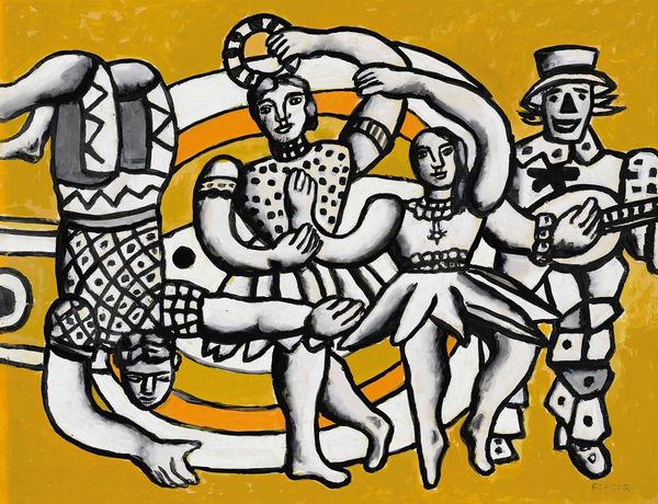
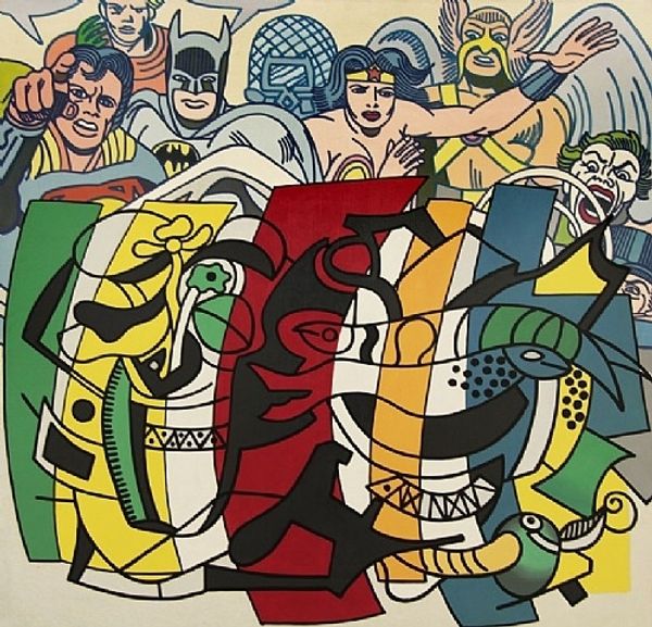
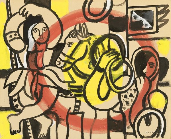
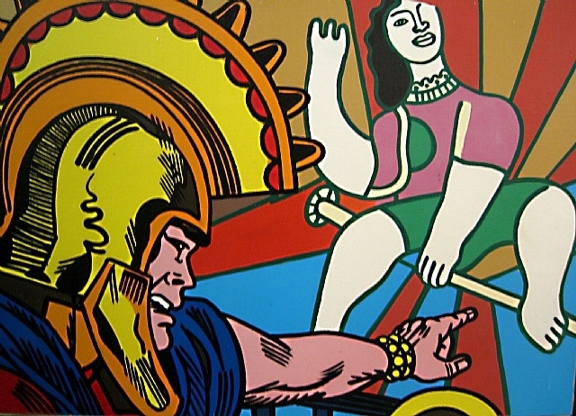
Erro made this “Hommage à Léger” painting with enamel, which is kind of like house paint. He’s laid it on super flat, in big bold colors, with hard black outlines, which is all very knowing, almost like it’s commenting on the slickness of commercial art. Enamel paint is not what you’d call subtle. There’s no blending or shading here; everything is loud and clear. It reminds me of those old pop art prints, but way more intense. Look at the woman’s arm reaching up – the flatness of the paint somehow makes it both present and distant, like a comic book panel but on steroids. It’s funny how Erro manages to make something so flat feel so forceful, so full of energy. Like a crazy, amped up version of Léger, or maybe even a nod to Lichtenstein’s comic book appropriations. It's a way to look at the world through a screen of images, and that’s what art is, right?