engraving
#
portrait
#
neoclacissism
#
16_19th-century
#
old engraving style
#
old-timey
#
19th century
#
history-painting
#
engraving
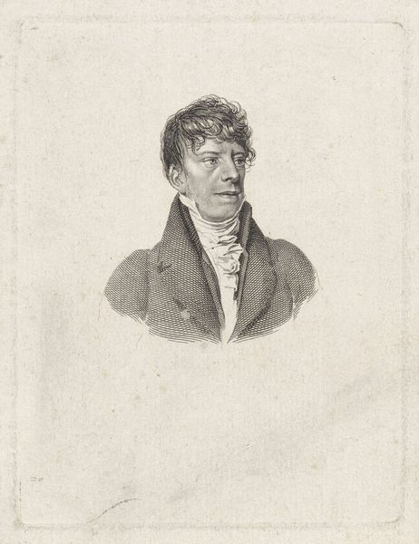
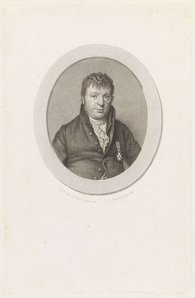
Dimensions: height 100 mm, width 95 mm
Copyright: Rijks Museum: Open Domain
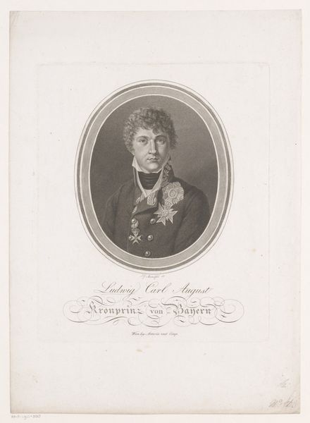
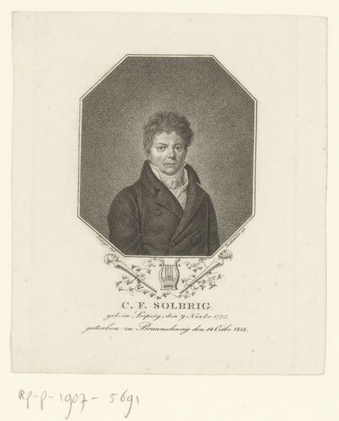
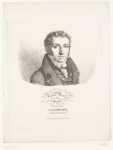
Editor: We're looking at a portrait of Dirk Kamphuizen, an engraving created sometime between 1807 and 1851, and now residing in the Rijksmuseum. I find its old-fashioned aesthetic quite captivating, like peering into a distant era. What visual elements strike you the most in this piece? Curator: The work is appealing as it follows strict principles of Neoclassicism through its focus on form, balance, and clear lines. Notice the perfect oval containing the figure, establishing a formal, controlled space. Editor: Yes, that shape gives it an air of sophistication. The engraver clearly wanted to contain and elevate the sitter. Can you elaborate on other intrinsic aspects? Curator: Certainly. Consider the treatment of light and shadow – the meticulous cross-hatching defines volume and texture with precision. The artist has skillfully employed contrasts to emphasize the subject's facial features. And did you observe the balance between the figure and the negative space? Editor: Now that you point it out, I appreciate how the carefully inscribed lettering below complements the portrait. The overall composition shows intent. Curator: Indeed. The artist emphasizes rational order, which speaks to Neoclassical ideals and creates visual unity through line work. Editor: Seeing the piece analyzed this way highlights its craftsmanship and the visual strategies in use, elevating the portrait’s design over mere likeness. Curator: Precisely. And understanding this structural elegance enriches our understanding, don’t you think? Editor: Absolutely, I learned a lot about looking at engravings, moving past my initial aesthetic impressions! Thank you!
Comments
No comments
Be the first to comment and join the conversation on the ultimate creative platform.
More like this