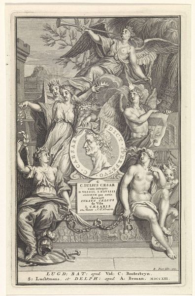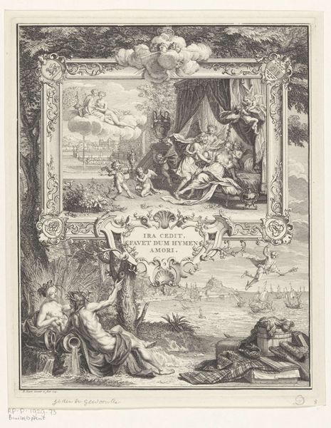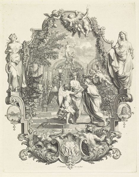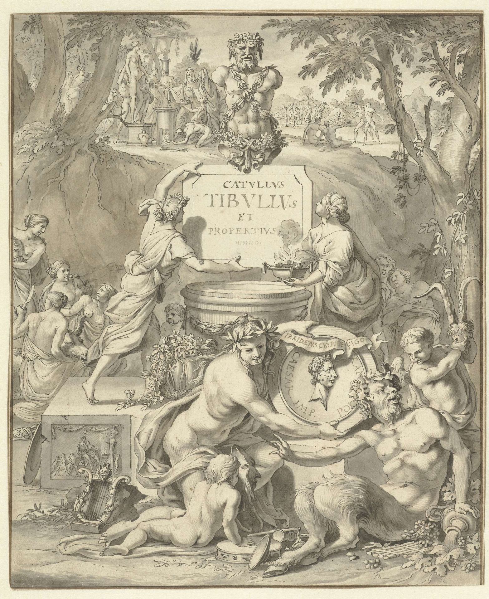
c. 1700
Frontispiece Design for a Book of Love Poems
Jan Goeree
1670 - 1731Location
RijksmuseumListen to curator's interpretation
Curatorial notes
Editor: Here we have Jan Goeree's "Frontispiece Design for a Book of Love Poems," a pen drawing and engraving dating back to around 1700. The allegorical scene feels almost like a crowded stage—very theatrical and definitely Baroque! What do you make of this flurry of activity? Curator: It bursts forth with an exuberant, almost overwhelming energy, doesn’t it? I imagine Goeree, pen in hand, letting the ink dance across the paper, conjuring a world brimming with classical figures, satyrs, and cupids… I love the way the inscription, floating between earth and sky, seems to beckon us into the book itself. Don't you get a sense of being invited to taste the wine of love, offered by these bacchanalian figures? Editor: I do see that now! All the figures, especially around the base, seem caught up in revelry. But what about the figures at the top, near that bust? They seem more…serious? Curator: Exactly! You've spotted the clever contrast. The upper realm, with its classical sculpture and more restrained figures, suggests the enduring, elevated nature of poetry. The lower realm explodes with earthly passions, the raw material from which those poems spring. Notice how the light filters down, illuminating both spheres. Perhaps the artist attempts to show poetry’s birth from passion? Editor: So, almost a link between the grounded and the divine? I guess it IS about love poems, after all. I appreciate the depth he brings to what could have just been simple celebration. Curator: And think about the purpose of a frontispiece - it’s a gateway, isn't it? Goeree invites us to step from the everyday into the world of verse, to lose ourselves in the beautiful chaos of love. It makes me want to dive into those poems! What about you? Editor: Absolutely! The idea that a single image can act as such a potent invitation, layered with meaning...it's really opened my eyes to what frontispieces can achieve. Thanks!