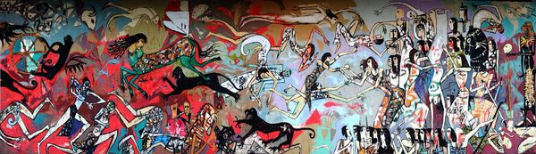
Curatorial notes
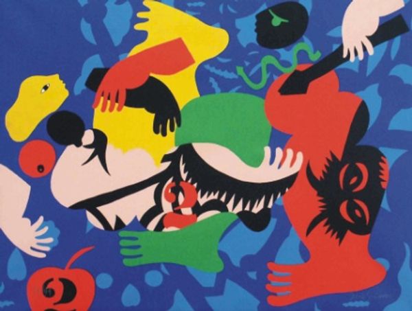
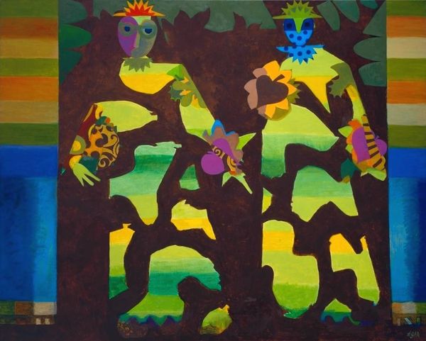
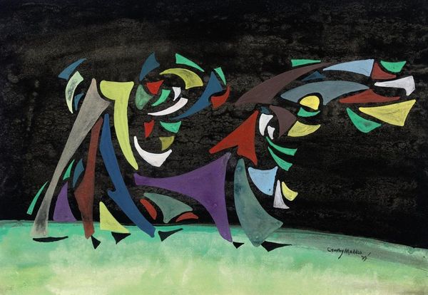
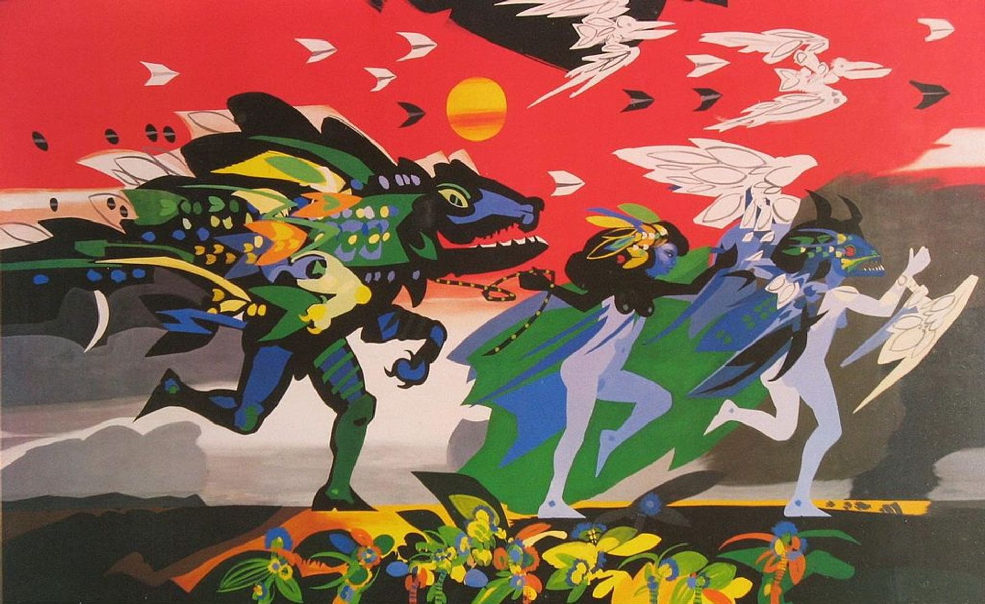
Alejandro Obregon made *Barranquilla* without specifying the date, but the flat planes of color and sharp, screen-printed style lines makes me think of the mid-century modernism. The palette is bold, even jarring, with the warm red sky contrasting with the cool figures in blues and greens. Looking closely, you can see how Obregon builds up the composition with these distinct shapes, like a collage. The texture feels smooth and graphic. It’s interesting how the paint isn’t blended; instead, there’s a deliberate separation between colors. Take, for instance, the running figure on the left – the patches of green, yellow, and blue suggest a kind of camouflage, but also a dynamic sense of movement and transformation. That dog like head is very Picasso, right? Obregon's use of symbolism and abstraction reminds me a little of Rufino Tamayo, who also used bold colors and simplified forms to convey deep emotion. Ultimately, this piece embraces ambiguity, inviting us to contemplate the relationships between culture, history, and personal experience.