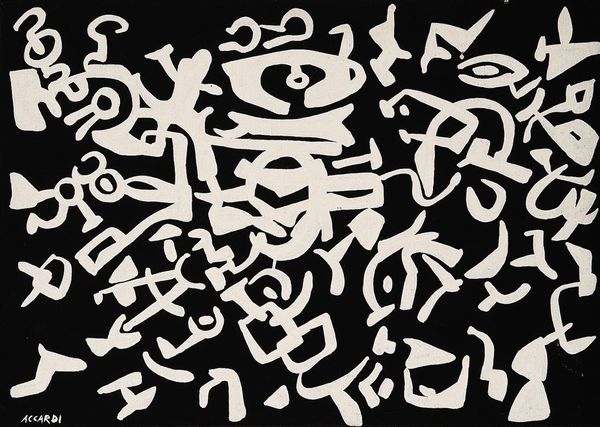
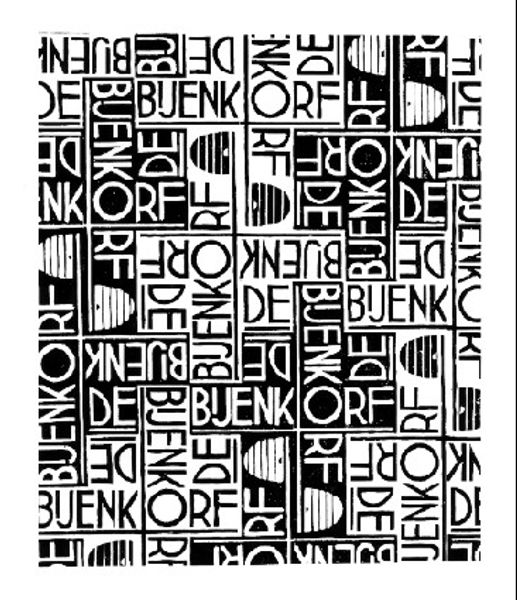
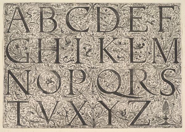
graphic-art, typography
#
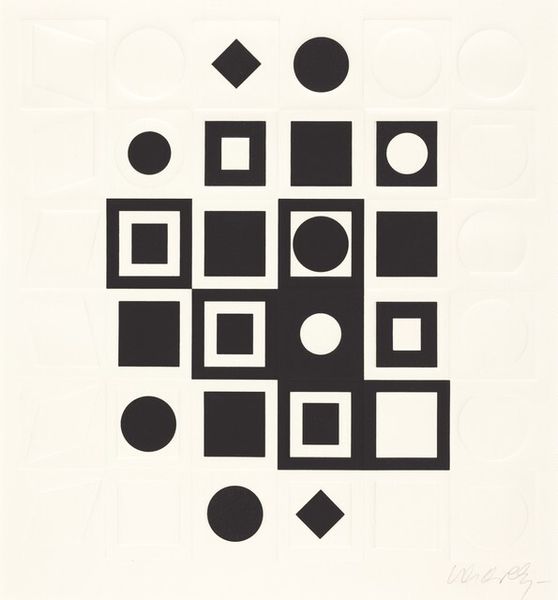
art-deco
#
pattern out of typography
#
graphic-art
#
type repetition
#
random pattern
#
typeface
#
op art
#
text art
#
text
#
typography
#
geometric
#
abstraction
#
line
#
pattern repetition
#
varying line stroke
#
funky pattern
#
repetitive pattern
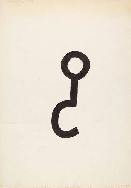
Copyright: Cassandre,Fair Use
Cassandre designed this typeface, Bifur, during the rise of advertising in the early 20th century. Lithography, a printing technique, was key to its production and distribution. The typeface has a bold geometric style that is strongly influenced by the aesthetics of the Art Deco movement. The visual impact of Bifur comes from the stark contrast between thick black lines and thin, closely spaced parallel lines, creating a play of solid and void. This required technical expertise to execute in printing, demanding precision in the alignment of each impression. Bifur reflects the industrialized aesthetics of its time, mirroring the machine age and mass production. Its functionality was to make advertising text as noticeable as possible, and it's a reminder of how design and typography were becoming essential tools in the commercial landscape. Ultimately, Bifur embodies the fusion of art and industry, illustrating how design could capture the spirit of an era defined by technology and consumer culture.
Comments
No comments
Be the first to comment and join the conversation on the ultimate creative platform.
More like this