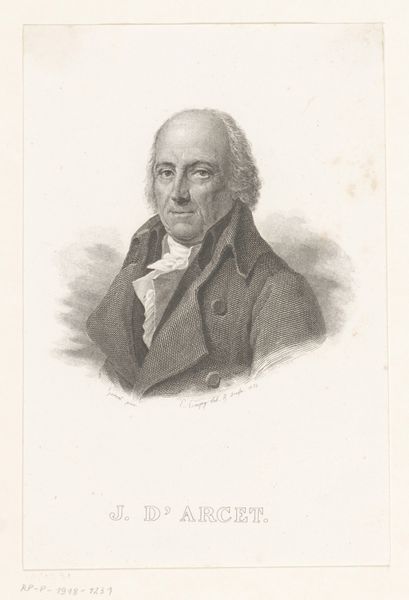
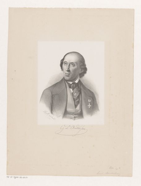
lithograph, print
#
portrait
#
lithograph
# print
#
caricature
#
realism
Dimensions: 330 mm (height) x 245 mm (width) (bladmaal)
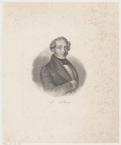
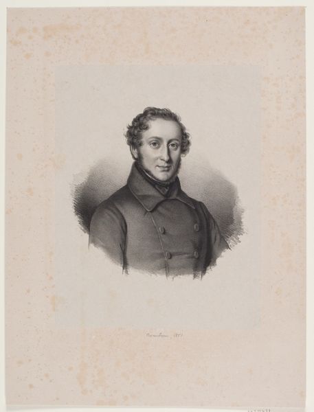
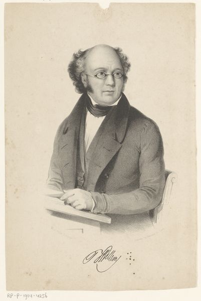
Curator: This is a lithograph portrait of Ludvig Jacobson, created sometime between 1839 and 1840 by David Monies. The piece resides here at the SMK, the Statens Museum for Kunst. Editor: My initial impression is that the work seems rather...stiff. The gentleman appears somewhat uneasy, as though caught in a formal pose. The tonal gradations achieved through lithography create a muted palette that suggests seriousness, and yet his peculiar coiffure hints at a subtle satirical edge. Curator: I think that’s a sharp observation. Monies likely aimed to capture not just Jacobson’s likeness, but his essence. He was after all a Professor, judging by the text included in the lithograph itself. A man of science and letters would perhaps feel constricted by societal demands around his status. The medal and decorations signify his achievements and standing in the community. These signifiers are integral to portraying social status in this era. Editor: Certainly, these symbols encode societal roles. However, observe the composition itself. The subject occupies only a small fraction of the picture plane. The blank space surrounding him—almost aggressively unoccupied—adds to that sense of discomfort I mentioned. The textural variations within the lithographic process almost appear like organic detritus floating around him, visually disrupting our reading of the composition and subtly undercutting Jacobson’s formality. Curator: I find your take very intriguing, given lithography's typical association with commercial reproduction at the time. It speaks to the democratizing function of image-making during the period. By capturing prominent figures and disseminating them widely, these prints offered a way for society to relate more closely to people previously inaccessible. While you may read tension and distance, I feel it actually allowed greater accessibility. Editor: Interesting counterpoint! From a strictly formal perspective, though, I'm intrigued by the subtle shifts in tonal values, the modulation of light and dark creating form. I find it so sophisticated within a seemingly constrained visual space. Curator: And I think in a broader sense, it’s this intersection between representation, accessibility, and individual identity which gives lithographs like this such cultural resonance and makes this such a striking image of the time. Editor: A compelling example of the interplay of individual and societal forces encoded within the picture plane. A masterful piece by Monies.
Comments
No comments
Be the first to comment and join the conversation on the ultimate creative platform.
More like this