Dimensions: 96.7 x 63.7 cm
Copyright: Jerry W. McDaniel,Fair Use
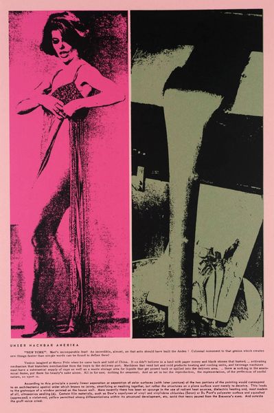
Curator: Jerry W. McDaniel designed this vibrant poster for "Harlow's" discotheque, circa 1968. Editor: There's an immediate boldness about it; the poster uses strong contrasting colors, and its stark graphic style makes it feel quite contemporary, even today. Curator: Indeed. Posters were gaining traction, finding unique placement outside, so they needed that visual punch, and economical execution, I'd argue, factored in, too. I think the artist cleverly integrated Art Deco sensibilities with the rising Pop Art aesthetic. You see it in the bold typography, simplified forms, and that focus on mass appeal, right? Editor: Absolutely, but also, the figures depicted, there is the female form almost swooning; this suggests a specific kind of theatrical performance, potentially one dominated by male power dynamics or the male gaze. Is there an intention to portray the glamorous, even artificial, atmosphere of these elite discotheques, perhaps reflective of power structures in the late 60s? Curator: It's a complex period, definitely worth that interpretation. There is this explosion of social change. The nightclub would serve, in many cases, to provide an inclusive site for diverse cultural activity. The title “New York’s Most Exciting Discotheque” would be key in that reading of your argument. These advertisements often catered to specific demographics, often aspiring for inclusivity. Editor: Which brings the address. We are very uptown on 79th street in Manhattan. Discotheques represented these social desires and dynamics playing out across multiple identity and social categories, especially when considering intersectionality. But do you agree that the female is posed somewhat seductively and is she passive in this dynamic dance between them? Curator: I am not necessarily arguing that point. It represents glamour from the period, although her pose is of course highly performative, it serves a function, it fulfills a societal demand. But more needs to be done to decolonize design studies. I see that as its real issue now, if we use today’s frameworks. Editor: A great point. By historicizing artwork, even design as seemingly lightweight as discotheque advertising, can provide invaluable lessons. Curator: Agreed. This examination illustrates why looking at works through a multitude of lenses grants a far deeper and complex understanding.
Comments
No comments
Be the first to comment and join the conversation on the ultimate creative platform.
More like this