c. 1934
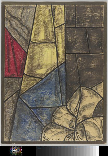
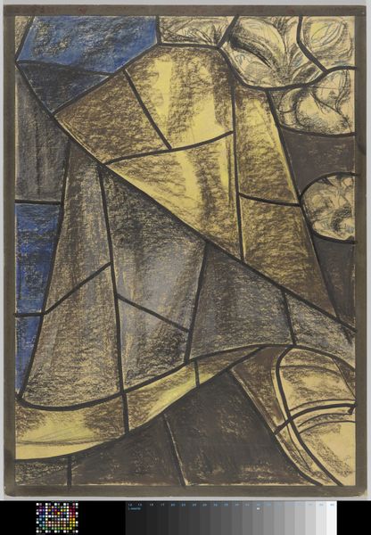
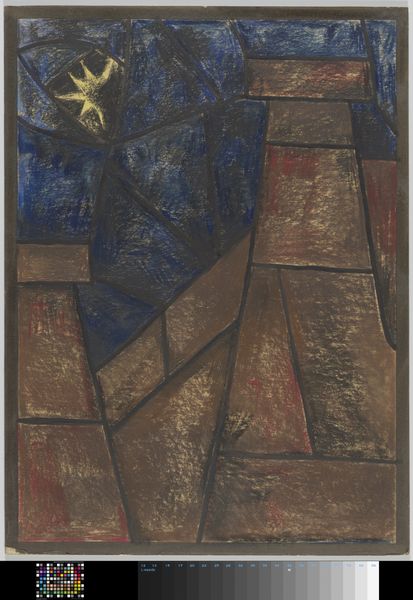
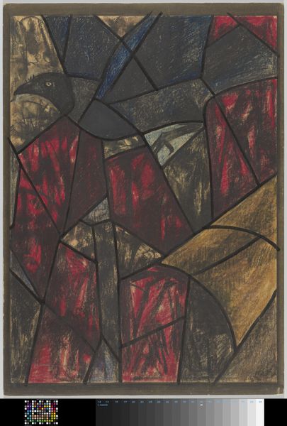
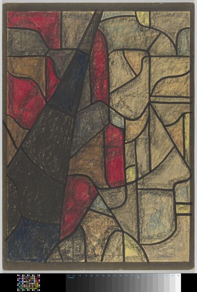
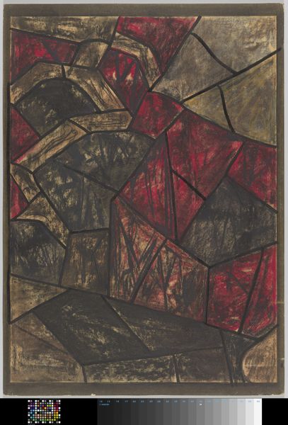
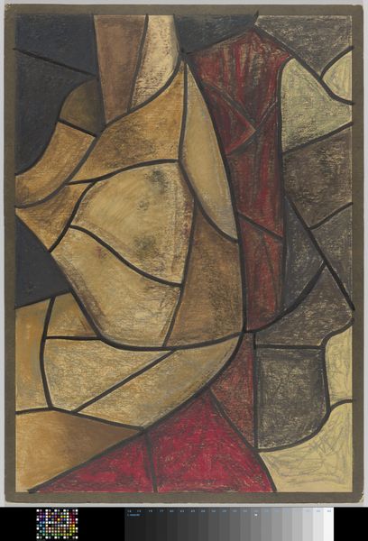
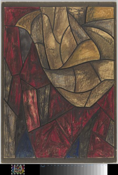
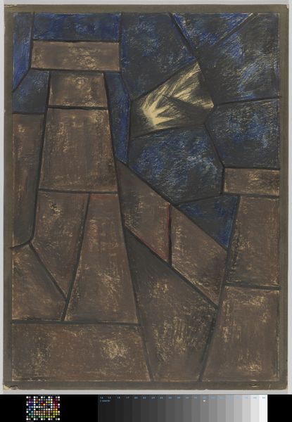
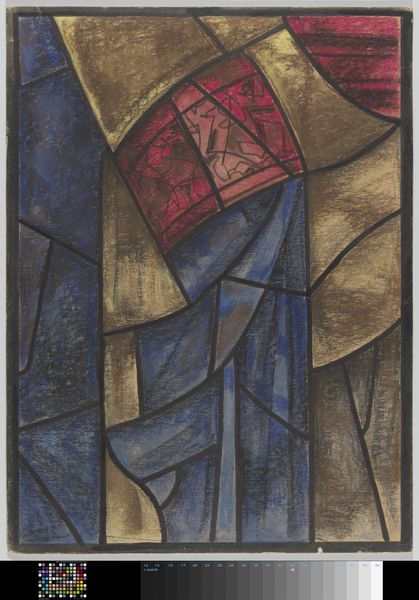
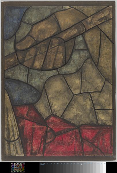
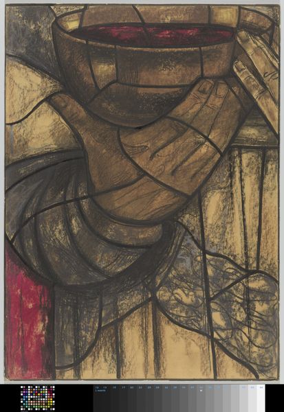
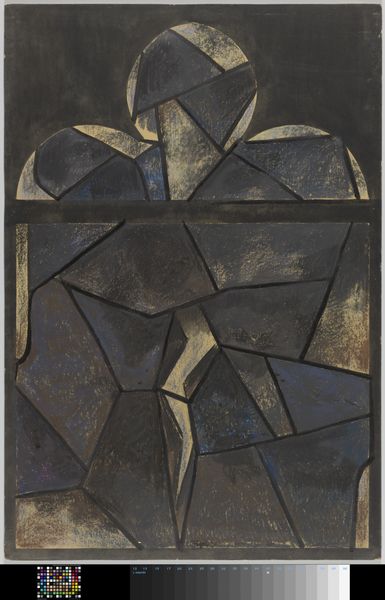
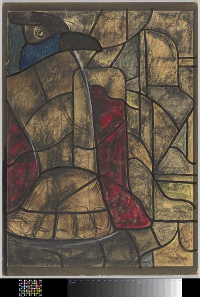
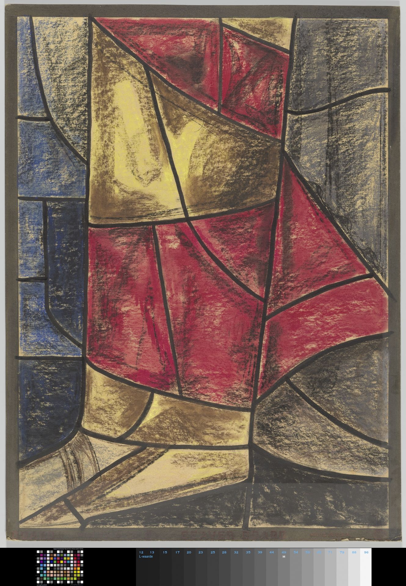
Ontwerp voor raam in het Noordertransept in de Dom te Utrecht
Richard Nicolaüs Roland Holst
1868 - 1938Location
RijksmuseumListen to curator's interpretation
Curatorial notes
Editor: We’re looking at “Ontwerp voor raam in het Noordertransept in de Dom te Utrecht,” a mixed-media drawing made around 1934 by Richard Nicolaüs Roland Holst. The design, intended for a stained-glass window, is all geometric shapes and muted tones. How should we approach looking at it? Curator: Primarily through its visual language. Note the careful orchestration of forms. The composition depends on how these shapes interlock, creating a sense of both tension and balance. Consider the lines themselves - their weight and direction establish the visual structure, and where do your eyes gravitate, and why? Editor: I find my eyes jumping between the strong reds in the centre and then out to the softer blues and yellows surrounding it. What is the effect of that? Curator: Precisely! The contrast is fundamental. Notice the tonal variations, how they create depth despite the overall flatness of the picture plane. Holst utilizes colour not descriptively, but structurally. The restricted palette ensures the forms, and their arrangement, remain paramount. Editor: So it's more about the relationship between colours and shapes than the story they might be telling? Curator: Precisely. Consider also how the artist is deploying media. Are we looking at clear delineations of different applied processes, or blending? Is there one visual reading throughout the image, or variation of style and method to enhance focal point(s)? It also reflects, cleverly, the fractured light a stained-glass window throws. Editor: That’s a helpful observation; I was thinking it felt quite abstract for a religious subject, but now it seems fitting for stained glass. Curator: The essence lies within its construction; the syntax of shapes, colours, and lines. We can interpret from this the language of Modernism itself! Editor: I appreciate that focusing on form unlocks so much. It makes abstract art seem much less intimidating.
