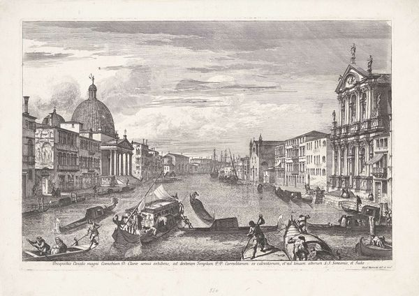
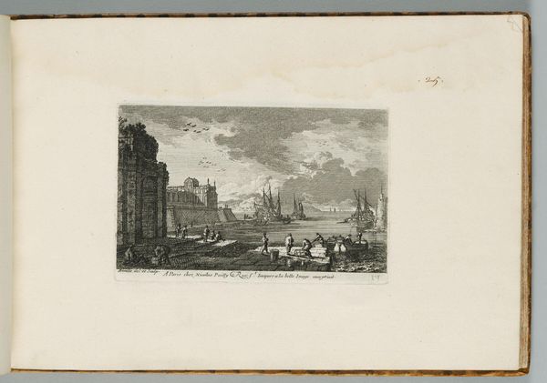
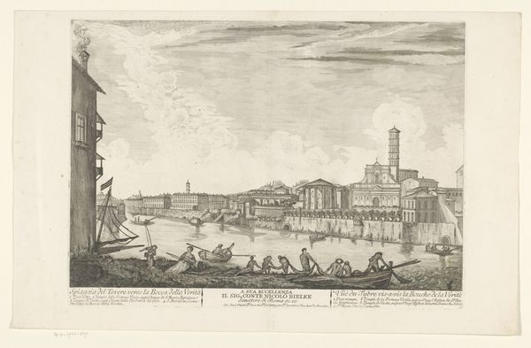
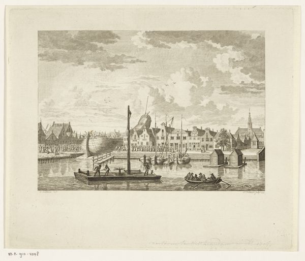
print, engraving
#
venetian-painting
#
baroque
# print
#
landscape
#
line
#
cityscape
#
engraving
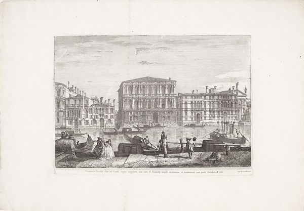
Dimensions: height 318 mm, width 472 mm
Copyright: Rijks Museum: Open Domain
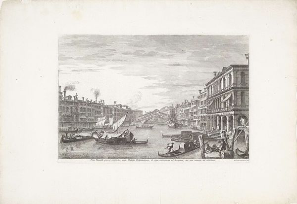
Editor: This is "Canal Grande te Veneția," created in 1741 by Michele Marieschi, and it’s an engraving. Looking at the intricacy of the lines, it's astonishingly detailed for such a small format, yet evokes this incredibly spacious feeling of being right there in Venice. What strikes you when you look at this artwork? Curator: What immediately grabs my attention is the meticulous orchestration of light and shadow achieved purely through line. Note the density of hatching in the lower left corner gradually dissolving into the shimmering highlights on the water. The use of line weight dictates spatial recession and proximity, where thin strokes recede and thicker ones draw closer, shaping our perception. Editor: So the artist isn’t just depicting Venice; he's also using line to construct depth and even direct our eye? Curator: Precisely! Observe how Marieschi employs linear perspective, guiding your sight toward the architectural landmarks, ultimately centering your attention on the iconic tower. This establishes the picture plane, framing depth, and giving volume to what otherwise could have seemed flat. Notice also the different techniques used: fine, short dashes suggesting the soft, hazy quality of the sky versus longer, more rhythmic lines portraying the stillness of the canal. What does the overall composition suggest to you? Editor: I see what you mean. The contrast is striking. To me, it feels very balanced despite the complexity of the scene. The details never overwhelm. Curator: Balance achieved through careful arrangement of forms. It's the hallmark of Baroque sensibility but viewed through an Italian lens, emphasizing clarity and structured grandeur. Editor: It’s fascinating how a single print can reveal so much about artistic intentions. I’ll definitely pay closer attention to how line creates depth and focus from now on. Curator: Indeed! The work is a microcosm of its era's aesthetic concerns – all cleverly contained within its linear framework. It encourages a closer appreciation for the elemental visual tools, the art in itself.
Comments
No comments
Be the first to comment and join the conversation on the ultimate creative platform.
More like this