drawing, watercolor, pencil
#
drawing
#
landscape
#
watercolor
#
romanticism
#
pencil
#
genre-painting
#
mixed medium
#
mixed media
Dimensions: 3 9/16 x 4 13/16 in. (9.05 x 12.22 cm) (image)4 x 5 3/16 in. (10.16 x 13.18 cm) (sheet)
Copyright: Public Domain
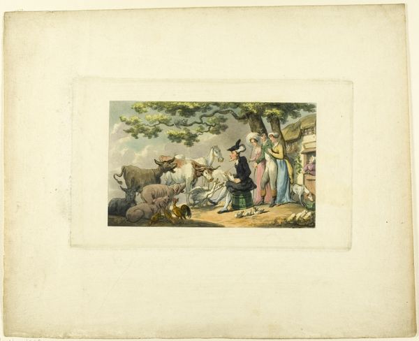
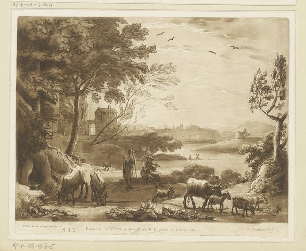
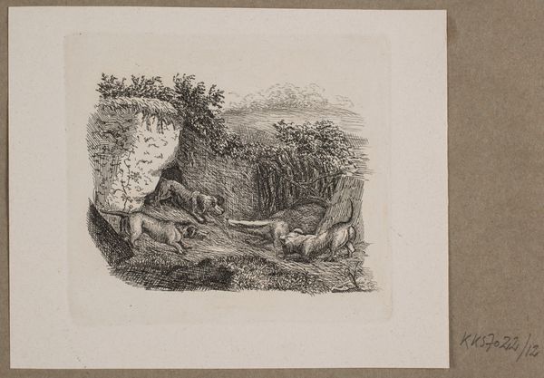
Curator: Looking at "Summer," a drawing dating back to around 1800, presently housed here at the Minneapolis Institute of Art. It is a wonderful piece employing pencil and watercolor. What's your immediate take? Editor: It evokes such a curious blend of revelry and unease. The composition feels active, almost chaotic, but rendered in muted tones that lend it a sort of melancholic atmosphere. I'm immediately drawn to the contrasting textures and delicate linework. Curator: Right. Let's dig a bit into that revelry, then. This work comes from an era when genre scenes became increasingly popular; artworks reflecting the life and times of the ordinary, the working class, and their leisure activities. The image may depict harvesting activities—notice the figure seeming to stomp something—or perhaps folk celebrations around those. What materials jump out at you here and how do they play into conveying meaning? Editor: Well, the visible pencil under-drawing hints at a structured compositional framework. Then the washes of watercolor soften those lines and create atmospheric depth. I’m curious about the significance of the limited palette, though. The subdued greens and grays – they convey this rustic, almost pastoral charm, but at the expense of vibrancy. Does the artwork betray underlying sociopolitical realities, you think? Perhaps a nostalgic or idealized depiction of rural life, subtly obscuring some form of hard realities that would be intrinsic to it? Curator: Possibly. Bear in mind the intended audience would often be those well-removed from that toil, enjoying the "rustic charm" from afar. Now, that raises questions of patronage, of the work's commodification of labor as entertainment. Consider also the perspective and size. It seems modest in scale, possibly intended for personal enjoyment. Perhaps even bound into a book, intended as gifts or souvenirs. But if its subject is workers’ toil, what does it communicate in its specific way? Is the perspective empathic or detached? Editor: An interesting conundrum. If we examine solely the relationships within the image itself, that tonal range creates depth. I mean, observe the focal play between light and shade across the cottage structure and within the trees. Then you get subtle variations defining each element in relation. The piece might not be making an argument, but it's very clearly proposing a visual space... Curator: Yes, yes, visual, material and social spaces – all informing each other and creating meaning beyond simply a surface aesthetic charm. It really invites further contemplation about those complex relations. Editor: Absolutely. It’s a fascinating encapsulation of its time and media.
Comments
No comments
Be the first to comment and join the conversation on the ultimate creative platform.
More like this