Copyright: Josef Albers,Fair Use
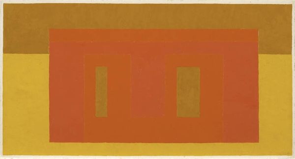
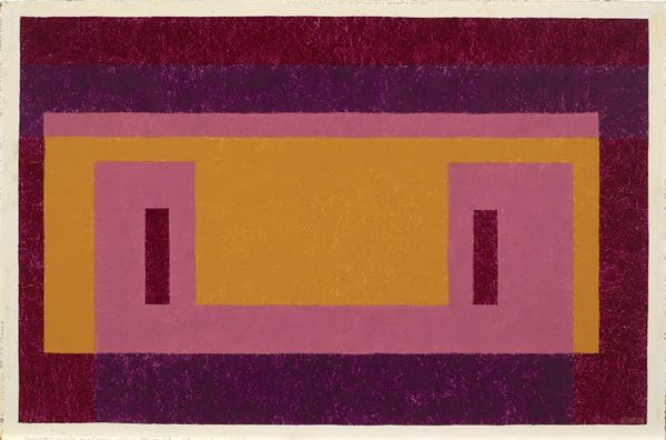
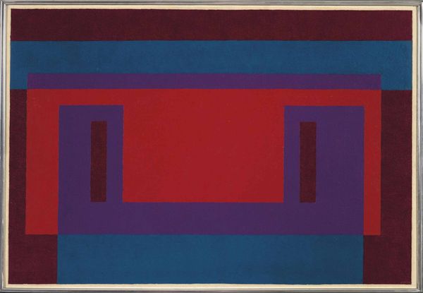
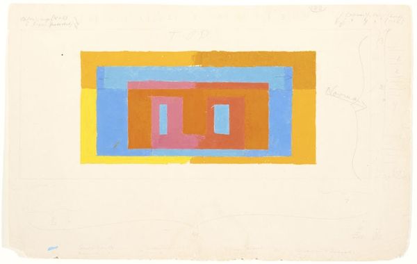
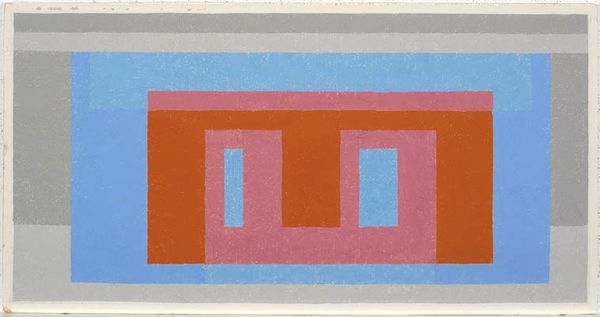
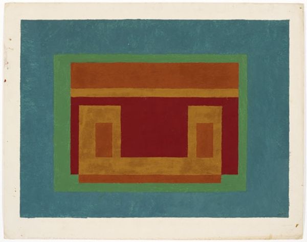
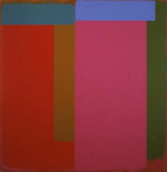
Editor: We’re looking at Josef Albers’ "Variant/Adobe," created in 1948. It's a print composed of nested, colorful rectangles, primarily in shades of pink, red and brown. At first glance, the geometric composition seems rather simple, yet there is an intriguing spatial ambiguity created by the overlaps. What’s your read on this work? Curator: You know, that initial sense of simplicity? Forget it! Albers wasn't just stacking shapes. He was a magician playing with perception. Imagine him, almost obsessively exploring how colors interact, push and pull, advance and recede. Look at how the central red rectangle hums against that earthy brown – does it feel like it's popping out at you or sinking into the background? Editor: I see what you mean. The red does vibrate a little. Is it supposed to be… unsettling? Curator: Not unsettling, perhaps… stimulating! He's prodding us to *feel* the colors. To sense their temperature. And the "Adobe" reference in the title suggests landscape. It's almost like he's bottled a sunset, right? Albers asks a deeper question about whether what we see *is* what is there at all? Editor: That’s really interesting, almost a challenge to our own senses. So he’s not just arranging colors; he’s kind of… challenging us. Curator: Precisely! He nudges us to understand colour relationships beyond just the hue itself, it's about the feeling they evoke. Editor: This makes me appreciate the work so much more than I did at first glance. It's deeper than just coloured rectangles, it’s a study of how we see. Curator: Exactly. Art, in its best form, is inquiry and experimentation that reflects on perception. That's why Albers is still teaching us, even now.
Comments
No comments
Be the first to comment and join the conversation on the ultimate creative platform.
More like this