Curatorial notes
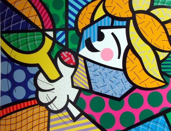
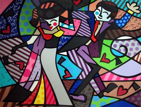
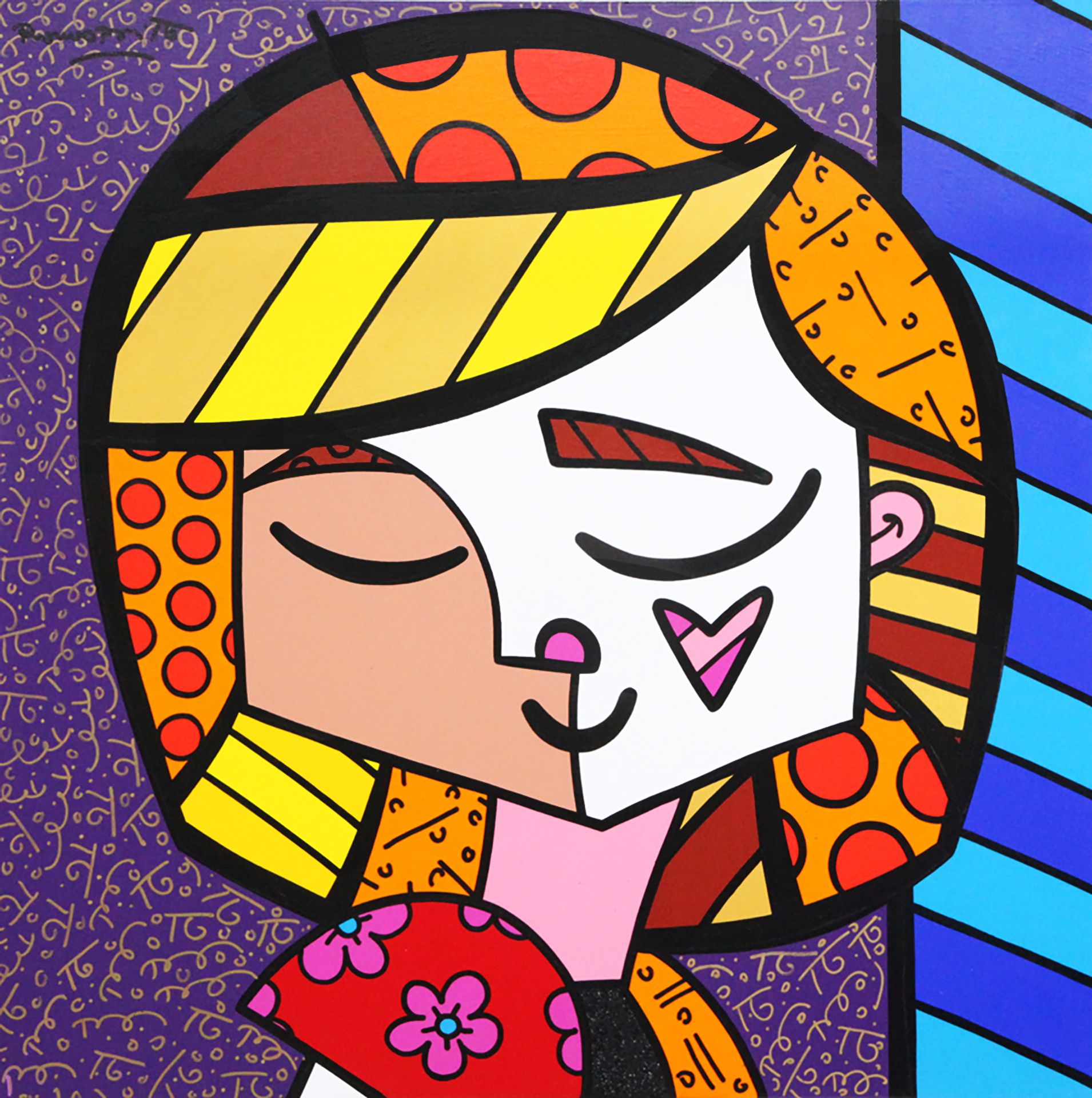
Editor: We're looking at Romero Britto's "Good Girl" from 2005, an acrylic painting that really pops with its bold colors. It feels playful, almost like a cheerful cartoon. What's your interpretation? Curator: From a formalist perspective, the immediate impact of "Good Girl" arises from its manipulation of form and color. Britto employs a rigorous geometry, dividing the composition into distinct, flat planes of contrasting hues. How does this fracturing contribute to the overall affect? Editor: It makes it feel really modern and graphic, but also maybe a little… disconnected? Like the parts don’t quite belong together. Curator: Precisely. This tension, achieved through abrupt shifts in color and pattern, is central to its aesthetic impact. Consider the use of line as well – the thick, black outlines. What purpose do they serve? Editor: They seem to define the shapes and keep the colors separate. Like stained glass. Curator: A valid analogy. These stark delineations amplify the contrast, reinforcing the picture plane's two-dimensionality. Do you perceive any sense of depth or recession despite this flatness? Editor: Not really. Maybe a little with the shading on her cheek? But mostly, it stays right on the surface. It’s interesting how the artist uses so many shapes to describe such a seemingly simple image. Curator: Indeed. Britto skillfully uses varied geometric patterns to energize the composition. And I wonder, where does it take your mind's eye as you consider its geometrical features? Editor: Now I see the details more clearly, the geometric patterns in it. Thanks for guiding me in viewing and interpreting this artwork with intention. Curator: A painting's form can be just as interesting as the image it creates. Thinking about the art elements is important.