drawing, ink
#
drawing
#
ink drawing
#
pen sketch
#
figuration
#
ink
#
expressionism
Copyright: Public domain
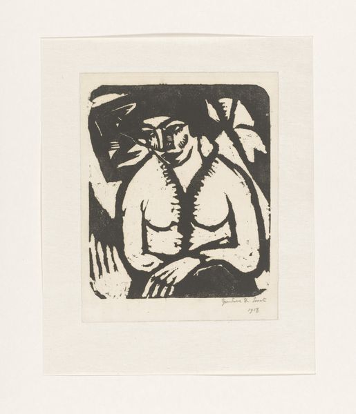
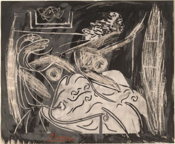
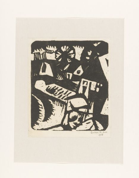
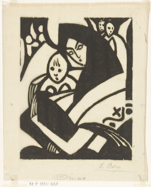
Editor: Here we have Christian Rohlfs' 1913 ink drawing titled "Death." It’s intensely dark and, well, a bit unsettling. The crude, almost violent lines contribute to the sense of unease. What strikes you most about this piece? Curator: Unsettling is right, and deliberately so, I think. Rohlfs uses the starkness of the ink, almost a woodcut effect, to hammer home the brutal reality of mortality. You see the raw energy of Expressionism here, a primal scream committed to paper. The figure of Death isn't some romantic, flowing robe specter, but a looming, almost architectural force, don't you think? Almost suffocating. Editor: Absolutely, there's nothing delicate about it. The geometric quality you mentioned, particularly in the figure of death, gives it this angularity which makes it so much harder to look at. I was expecting something ethereal, perhaps. Curator: Precisely. That harshness is the point. And look at how little detail is given to the figure on the bed. A few lines suggesting bones, vulnerability stripped bare. This isn’t about mourning a specific person; it's about confronting the universal terror of the unknown. Are we more sensitive to mortality in this era than they were then, or perhaps less so? Editor: It makes you wonder. I’d never considered Expressionism so raw on this topic before, this is a new insight for me. Curator: And perhaps that’s the most potent thing art can do. It rattles our cages, forces us to consider the uncomfortable truths we so often try to ignore.
Comments
No comments
Be the first to comment and join the conversation on the ultimate creative platform.
More like this