Ernstig woord aan alle Burgers en Arbeiders van Amsterdam Possibly 1903 - 1906
0:00
0:00
graphic-art, typography, poster
#
graphic-art
#
type repetition
#
art-nouveau
#
script typography
#
hand-lettering
#
text art
#
hand drawn type
#
hand lettering
#
word art
#
typography
#
hand-drawn typeface
#
thick font
#
typography style
#
decorative-art
#
poster
Dimensions: height 56 cm, width 44.3 cm
Copyright: Rijks Museum: Open Domain
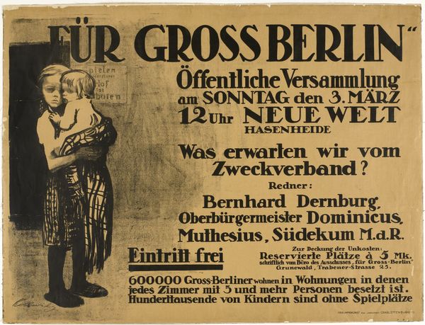
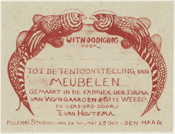
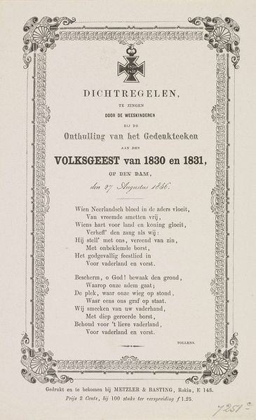
This poster, made by Comité van Verweer, is a monochrome work, printed on paper. All the visual information is conveyed through the letterforms and their arrangement on the page. The black ink and white paper remind me that art is a process of figuring things out, of pushing and pulling until something clicks. I like the way the information is stacked, in order of importance. Look at the names of the artists involved in the exhibition, framed in a rectangle made of thin and thick rules. The names are stacked democratically, which tells you something about this group and their process. The date for the exhibition is also given prominence, as is the philanthropic aim to raise money for Dutch children. Posters like this are part of an ongoing conversation, a way of talking to the public. It has the directness of someone like Corita Kent, a nun and graphic designer, who used words and images to talk about peace and justice. It’s all about clarity and impact, leaving no room for doubt, but also inviting multiple readings.
Comments
No comments
Be the first to comment and join the conversation on the ultimate creative platform.
More like this