acrylic-paint
#
abstract-expressionism
#
abstract expressionism
#
op-art
#
op art
#
pop art
#
colour-field-painting
#
acrylic-paint
#
form
#
geometric
#
geometric-abstraction
#
abstraction
#
pop-art
#
line
#
modernism
#
hard-edge-painting
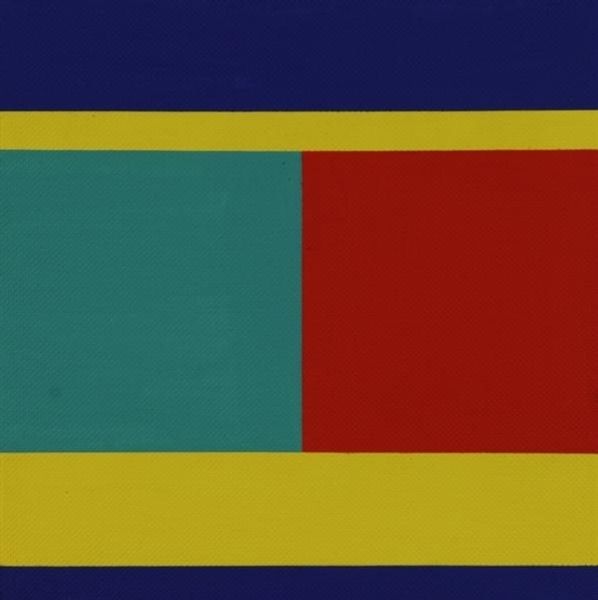
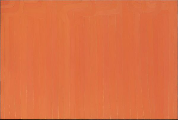
Copyright: Jeremy Moon,Fair Use
Curator: We’re looking at Jeremy Moon’s “Naxos” from 1964, made with acrylic paint. It's quite striking, isn't it? Editor: Strikingly... simple, I'd say. That central field of Yves Klein Blue—it sucks you right in! A cobalt vortex surrounded by these confident, contrasting lines. It feels very mid-century cool. Curator: "Cool" is an interesting way to describe it. Moon’s work often engaged with the minimalist trends of the time and particularly explored Colour Field Painting. The color choices themselves can be seen in dialogue with post-war optimism in Britain. What feelings do the colour evoke for you? Editor: For me, that sharp red clashes gorgeously with the mellow yellow and green! It feels very Mondrian mixed with a beach vacation vibe. Does that make any sense? Like a geometric sunset... on, you know, an austere alien planet. Curator: Well, there are interesting socio-historical points we can consider too. Color Field painting, like hard-edge painting, also became increasingly popular in corporate spaces during this period as well as galleries, and they have served different socio-political purposes. I am not sure, for instance, the gallery shows the painting now as it did at the moment it was shown. Editor: I can imagine how this hung in a boardroom somewhere, injecting a shot of modern "art" to show off the business as "current." But there’s something inherently defiant, playful, even, in the colour palette. It undermines that sterile ambition somehow, at least to my eye. Like, here's your corporate art but it secretly likes to wear Hawaiian shirts and listen to The Beatles on the weekends. Curator: It’s difficult to look at this image now without reading how deeply intertwined these minimalist aesthetic experiments were to the economic forces shaping the culture in Britain. How it may, perhaps, unwittingly represent institutional efforts to flatten or even abstract expression into corporate productivity. Editor: Mmm, but does it *feel* flat though? For me, "Naxos" invites daydreaming, plain and simple. Curator: And sometimes, just maybe, that's the point. Even institutional attempts to control meaning have loopholes. Editor: Amen! There's liberation in those bright colour combos, isn't there? And a sneaky reminder not to take everything too seriously, including our perspectives.
Comments
No comments
Be the first to comment and join the conversation on the ultimate creative platform.
More like this