Copyright: Modern Artists: Artvee
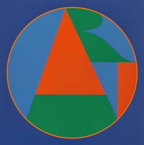
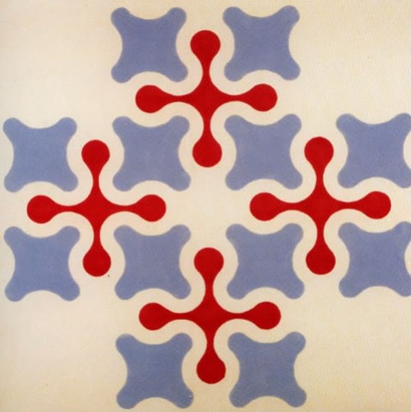
Editor: Robert Indiana's "Yield Brother," a print from 1971, is so striking. The bold colors and geometric shapes, especially the repeating circular motifs containing what appear to be peace symbols, give it a very graphic, almost instructional feel. What are your initial observations regarding the work's formal qualities? Curator: Formally, the piece is a sophisticated exercise in semiotics and color theory. Notice the primary color palette—red, blue, and yellow—intensified by the stark black, producing a visual dynamism. The hard-edged geometric forms arranged within concentric circles and intersecting planes suggest both unity and fragmentation, order and disarray. The “peace symbols,” as you call them, command visual emphasis but their slight variance raises compelling questions about symbolic interpretation. What effect do you think this geometric ordering has on the viewer? Editor: I see that there is symmetry in the placement of the symbols, however each has a different direction, causing them to pull you to a different spot in the piece. Is it meant to destabilize the viewing experience? Curator: Precisely. The tension generated by the conflicting orientations prevents visual resolution. It denies the viewer a single focal point. Note also the relationship between positive and negative space—how the words "YIELD BROTHER" are articulated. Does the relationship have an impact? Editor: That is compelling. With the words, it's as if what is there is as important as what is not. Thank you! Curator: Absolutely, it provokes discourse surrounding not only form but also function; that art serves as vehicle and not a monument. A lot to take in indeed.
Comments
No comments
Be the first to comment and join the conversation on the ultimate creative platform.
More like this