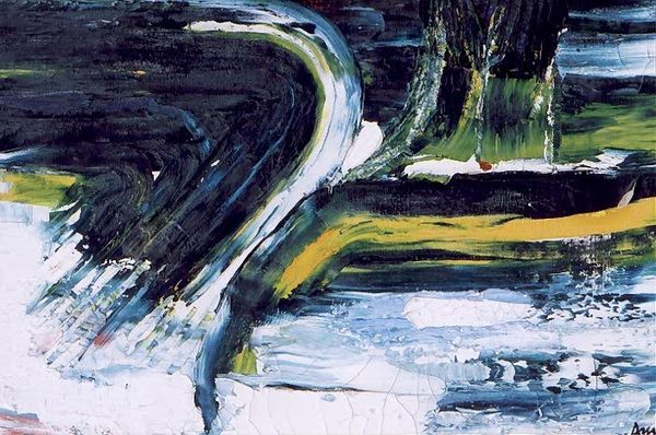
Dimensions: support: 514 x 1168 mm frame: 850 x 1455 x 90 mm
Copyright: © The estate of Ivon Hitchens | CC-BY-NC-ND 4.0 DEED, Photo: Tate
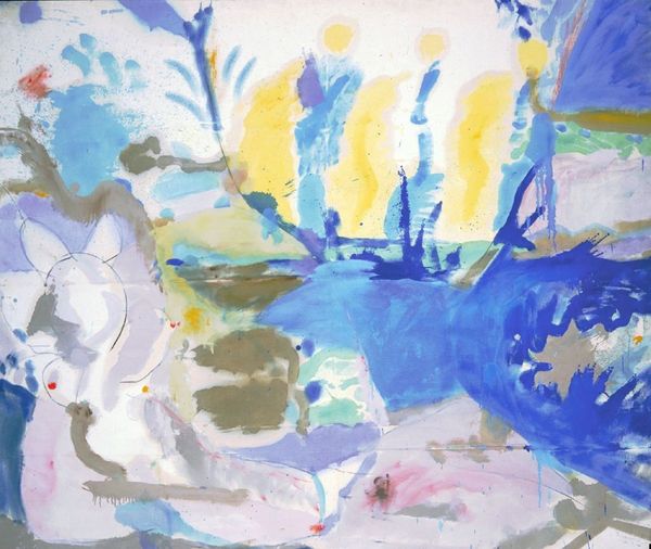
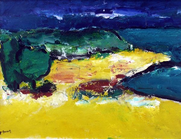
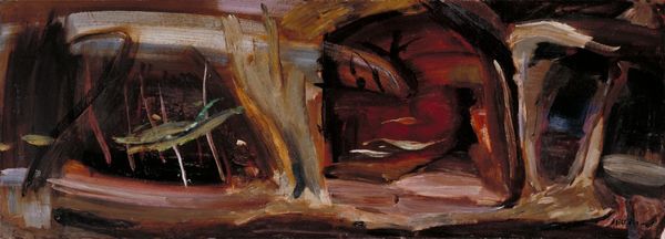
Curator: Standing before us is Ivon Hitchens' "Divided Oak Tree, No. 2," currently housed in the Tate Collections. Editor: My first thought is about the raw energy! It's almost violently joyful, the way those colours clash and dance. Curator: It's fascinating how Hitchens, born in 1893, pushes at the edges of representation. Look at the sheer physicality of the paint itself. Editor: Yes, that impasto, that thick application of paint, is very striking. It seems almost wasteful, indulgent even – a real luxury of material. You can imagine the effort, the labor, that went into each stroke. Curator: Absolutely, and it's precisely that indulgence, that material richness, that allows us to feel the scene, the weather, in a way that a photograph never could. It’s the tree's essence, not its likeness. Editor: So, not just a tree, but the idea of a tree, filtered through the lens of experience and, of course, a whole lot of paint! Curator: Precisely. It’s a landscape distilled to its emotional core. Editor: It really makes you think about the materials artists choose and what that means. Curator: It does, doesn't it? And how they transform those materials into something that speaks to us on such a deeply personal level.
Comments
tate 12 months ago
⋮
http://www.tate.org.uk/art/artworks/hitchens-divided-oak-tree-no-2-t02216
Join the conversation
Join millions of artists and users on Artera today and experience the ultimate creative platform.
tate 12 months ago
⋮
In the late 1950s Hitchens began to paint series of landscapes based on one subject such as the 'Divided Oak Tree'. He chose an oblong canvas because it encouraged the viewer's eye to range freely over the image, as his own eye had originally analysed the landscape. Bands of colour run across the painting, enhancing a sense of the horizon, but the divided oak at centre left brings the viewer back to the middle. The patches of white canvas in his pictures have a particular function. He wrote, 'The intention is that the spectator's eye can travel along these areas, from floe to floe, over the picture surface instead of being engulfed or drowned in a morass of paint representing or aping realism'. Gallery label, September 2004
More like this