About this artwork
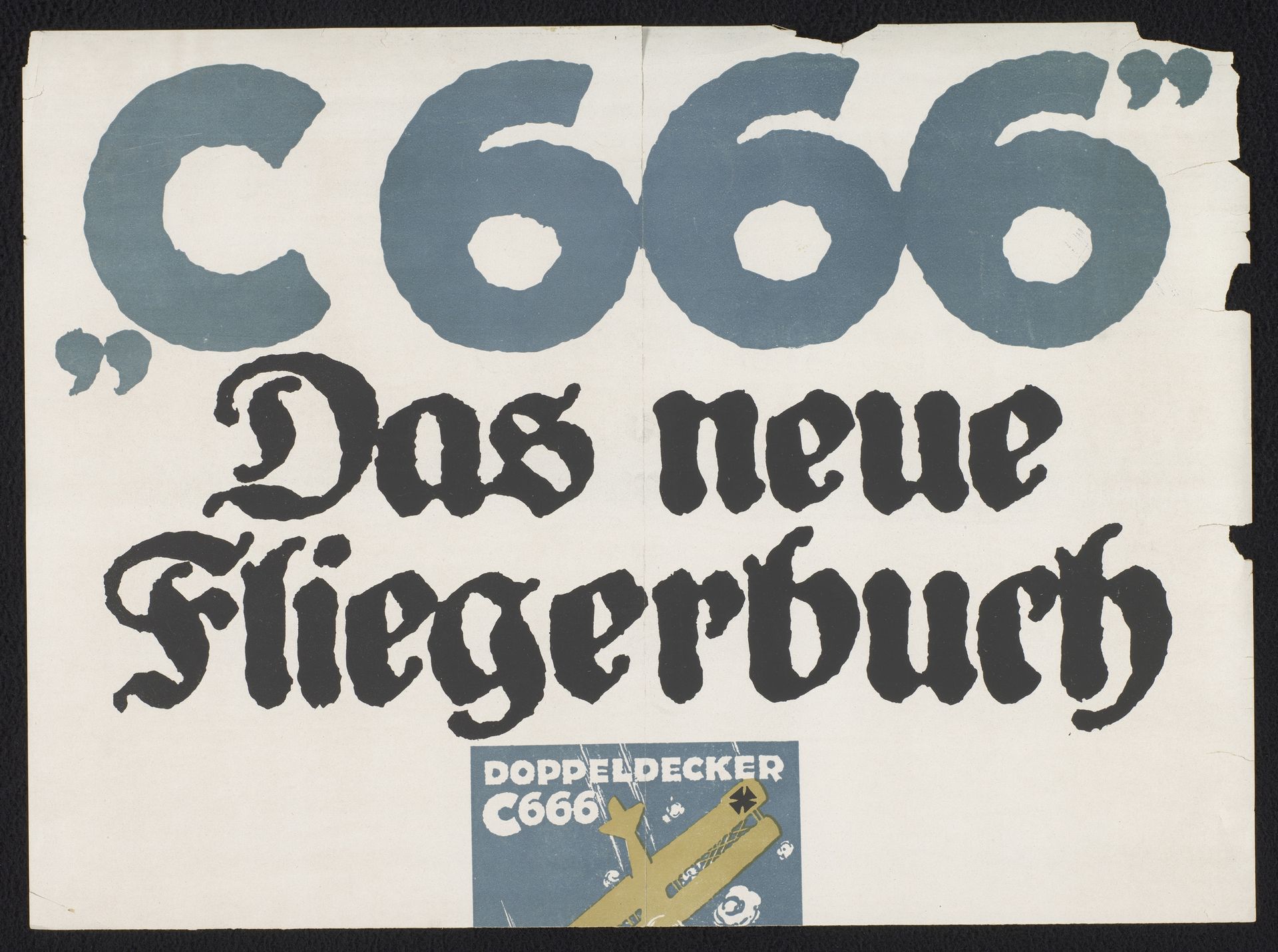
Here's an advert for ‘Das Neue Fliegerbuch’ - ‘The New Flyer Book’, showing a biplane from an unknown artist. It’s a two-tone affair, bluey-grey and black on an off-white ground. What strikes me is the hand-wrought nature of it all, in the bold shapes of the letters, and in the smudgy textures within them. It’s a print, but it feels very graphic and immediate, not slick or corporate. The letters look like they were printed using a stencil and a fat brush, and the imperfect inking emphasizes the material reality of its making; you get a sense of the artist making a transfer, and of the pressure of the squeegee. I see a relationship between this kind of approach and that of someone like Elizabeth Murray who used bold graphic shapes and forms in her own paintings, to create a similar sense of playful ambiguity.
Artwork details
- Medium
- graphic-art, print, typography, poster
- Dimensions
- height 343 mm, width 468 mm
- Copyright
- Rijks Museum: Open Domain
Tags
graphic-art
art-nouveau
typography
typography
poster
Comments
No comments
About this artwork
Here's an advert for ‘Das Neue Fliegerbuch’ - ‘The New Flyer Book’, showing a biplane from an unknown artist. It’s a two-tone affair, bluey-grey and black on an off-white ground. What strikes me is the hand-wrought nature of it all, in the bold shapes of the letters, and in the smudgy textures within them. It’s a print, but it feels very graphic and immediate, not slick or corporate. The letters look like they were printed using a stencil and a fat brush, and the imperfect inking emphasizes the material reality of its making; you get a sense of the artist making a transfer, and of the pressure of the squeegee. I see a relationship between this kind of approach and that of someone like Elizabeth Murray who used bold graphic shapes and forms in her own paintings, to create a similar sense of playful ambiguity.
Comments
No comments