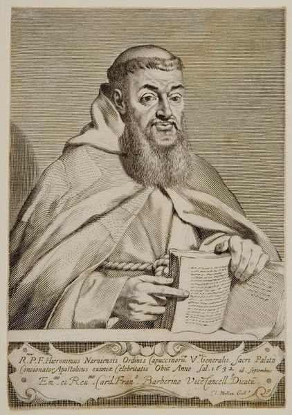
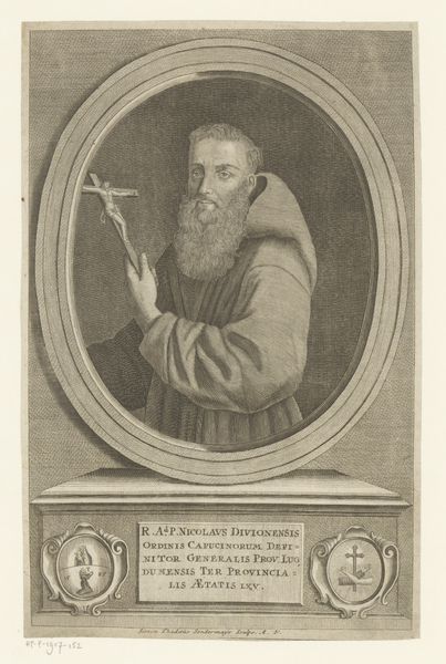
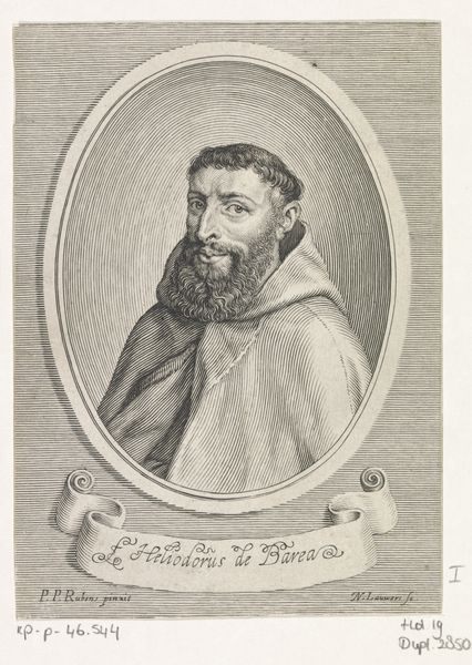
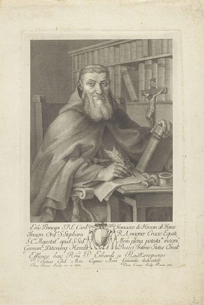
engraving
#
portrait
#
baroque
#
old engraving style
#
figuration
#
form
#
portrait reference
#
limited contrast and shading
#
line
#
history-painting
#
engraving
#
realism
Dimensions: height 213 mm, width 152 mm
Copyright: Rijks Museum: Open Domain
Editor: Here we have Claude Mellan’s engraving, "Portret van Girolamo Mautini", dating sometime between 1632 and 1688. It’s a rather striking portrait. I’m drawn to the intricacy of the lines, particularly in rendering the subject’s face and beard, but I wonder about the overall effect... it seems quite detailed, yet almost a little flat. What do you see in this piece that perhaps I’m missing? Curator: Ah, a fine observation! I'd say the magic lies precisely there, in that tension between detail and flatness. Mellan was quite the master of line, wasn't he? It’s as though he’s trying to capture not just the likeness, but also the very *essence* of Mautini – the man behind the beard and habit. Do you notice how the light seems to almost vibrate off the page, solely through the density and direction of those lines? It reminds me of looking through a window after a rain, seeing the world slightly refracted. Editor: I see what you mean! The lines create a sense of depth despite being so uniform. But was this limited contrast common for engravings from this period, or was Mellan exploring a different technique? Curator: He was definitely experimenting! Many artists used hatching and cross-hatching to build up tonal values, creating more contrast. Mellan’s devotion to single, unbroken lines, though… that's something else. Almost meditative, wouldn’t you agree? It invites us to slow down, to truly *see* the layers of texture and character revealed with each stroke. Editor: I never thought of it that way! I was initially a bit underwhelmed, but now I appreciate how such simple lines can be so effective. Curator: Exactly! Sometimes the greatest beauty lies not in how much you add, but in how cleverly you subtract, distill, and refine the world around you into its purest form. Don't you think?
Comments
No comments
Be the first to comment and join the conversation on the ultimate creative platform.
More like this