#
quirky illustration
#
childish illustration
#
pen drawing
#
pen illustration
#
old engraving style
#
text
#
flat colour
#
linocut print
#
ink drawing experimentation
#
pen-ink sketch
#
line
#
sketchbook drawing
Copyright: Public domain
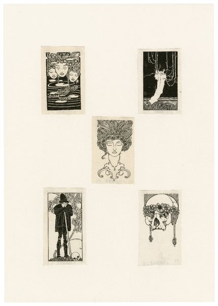
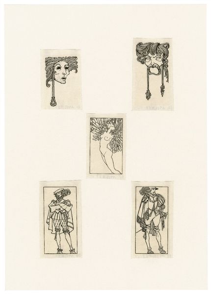
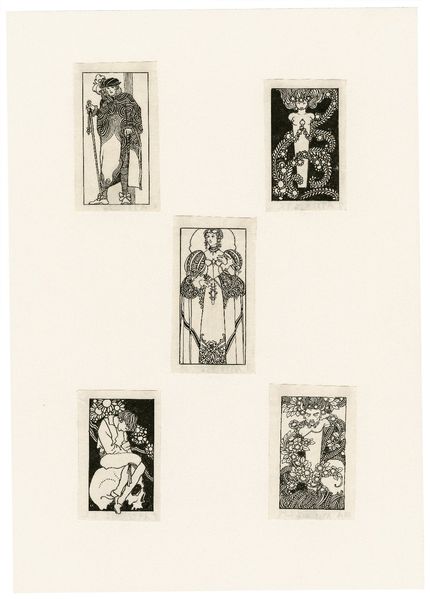
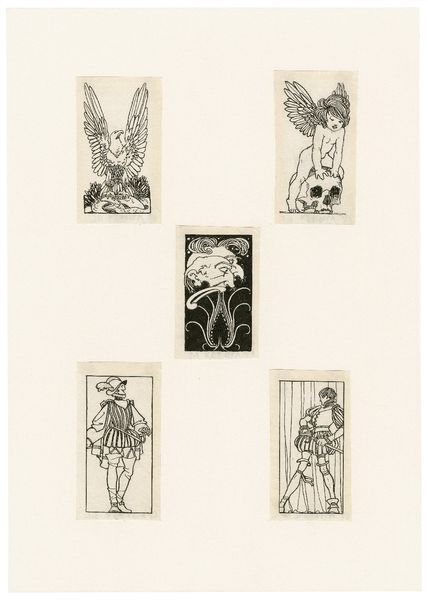
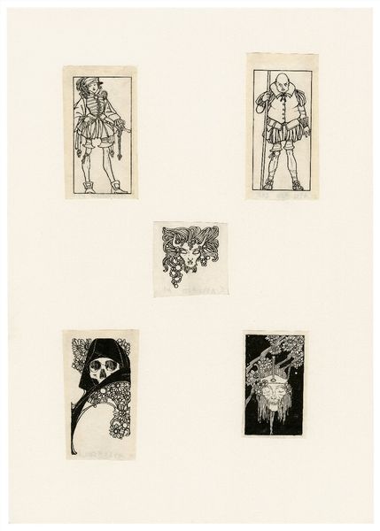
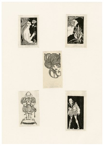
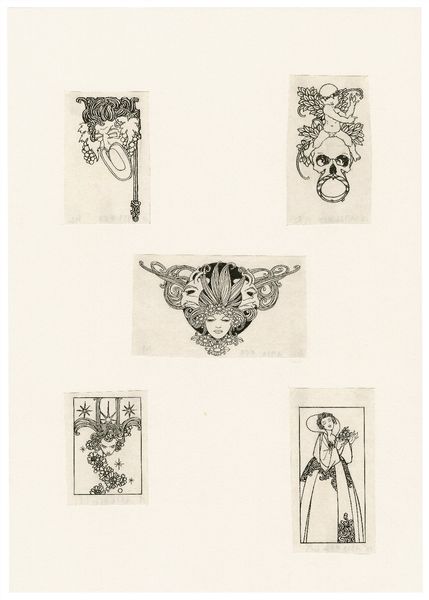
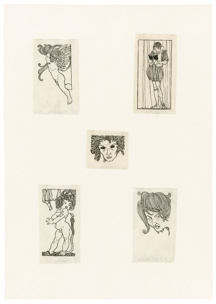
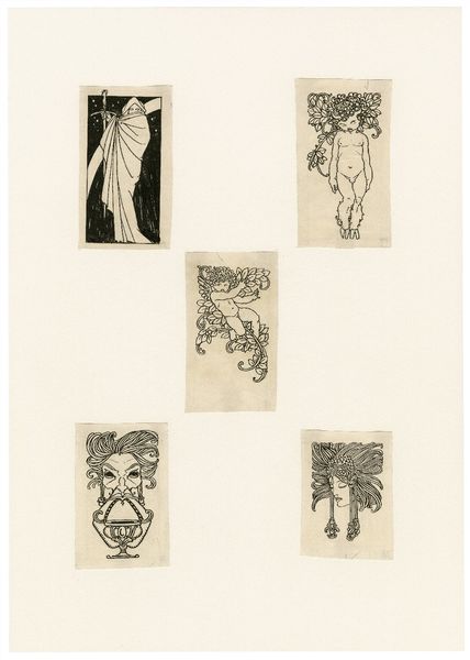
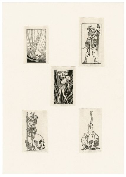
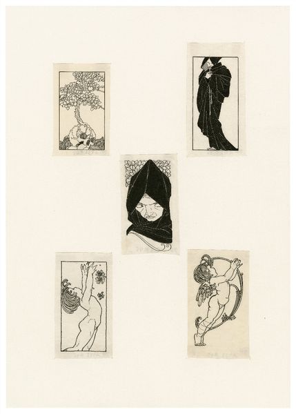
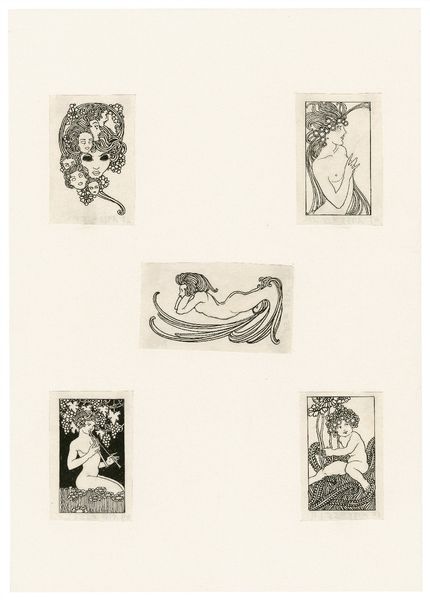
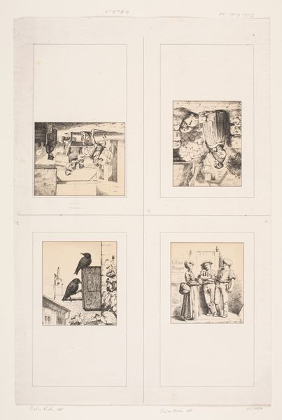
Editor: We’re looking at “Hamlet” by John Austen, a series of illustrations created using pen and ink. The images are quite small and the lines are incredibly precise. What stands out to me is the stark contrast between the black ink and the white background, giving it a really graphic quality. What do you see in this piece from a formal perspective? Curator: The interplay of positive and negative space is indeed critical. Notice how Austen uses line not just to define forms, but also to create textural variations. Consider the density of lines used to depict shadow versus the sparser lines used for highlighting. This strategic variation contributes significantly to the visual rhythm across the set. How do you interpret the repetition of rectangular forms in each miniature drawing? Editor: I hadn't really noticed that, but now that you mention it, each one is in a way framed as a rectangular stage... Is it perhaps an indication of something beyond the literal narrative on display here? Curator: Precisely. This geometric structure is an insistent motif that imposes a sense of order, almost a calculated restraint, upon the more organic, flowing lines of the figures themselves. Think about the ways in which these visual structures speak to, or perhaps even control, the emotive content of each panel. How does the stark black and white palette contribute to your reading of the composition as a whole? Editor: It feels very dramatic, reducing the complexities of the characters to pure form and contrast. It is intense, like shadows, not fully filled in. Curator: Exactly! The absence of color pushes us to analyze the strength of Austen's line work and spatial arrangements to interpret Shakespeare’s characters and moods. I would say, the artist prompts the viewer to move away from textual adaptation to embrace the visual rhetoric of his lines. Editor: Seeing the piece through the lens of formal elements really deepened my appreciation of its visual language. I would like to revisit the Bard with a fresh mind. Curator: And, hopefully, a heightened sensitivity to how form can function as its own language, coexisting and commenting on more traditional forms of narrative.
Comments
No comments
Be the first to comment and join the conversation on the ultimate creative platform.
More like this