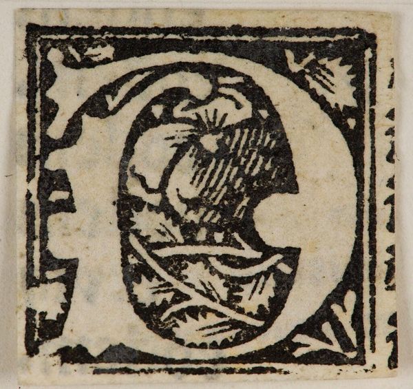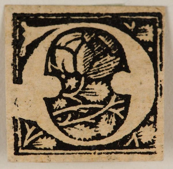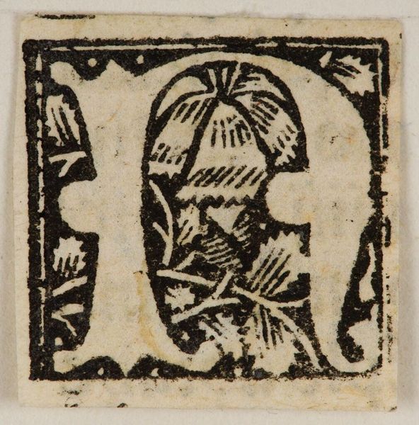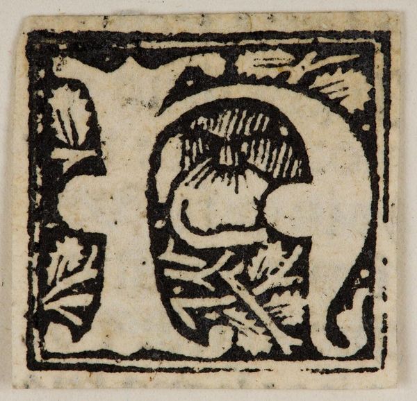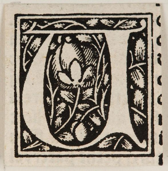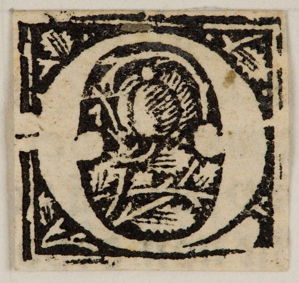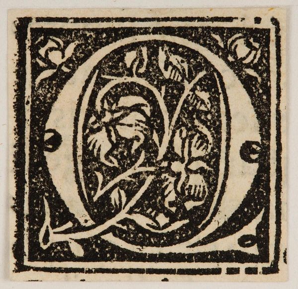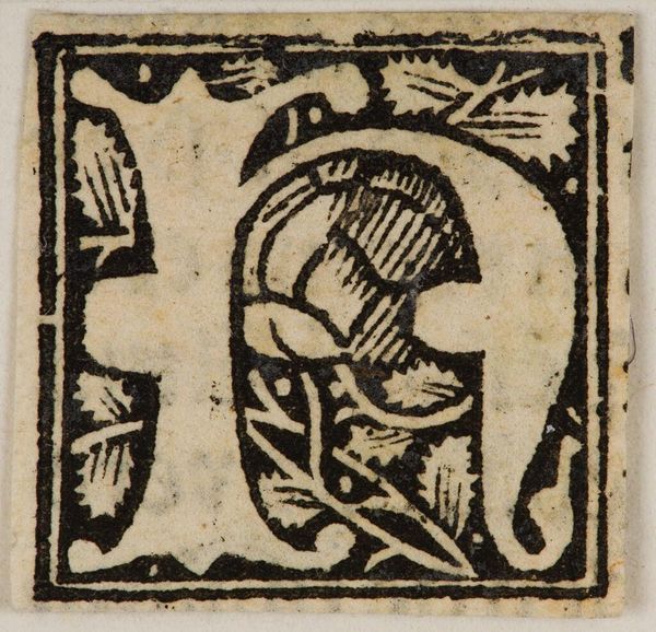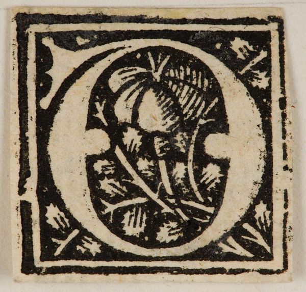
c. 16th century
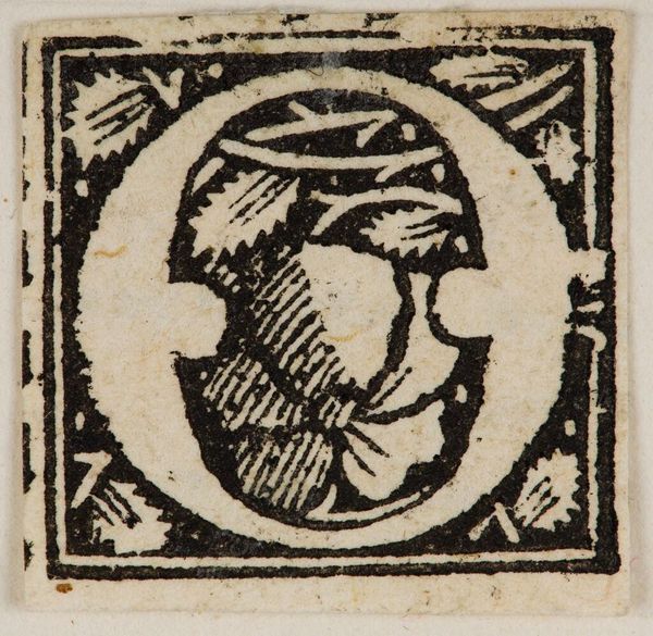
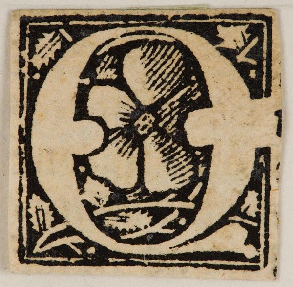
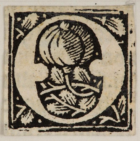
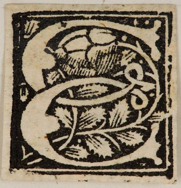
Initial G (?)
Listen to curator's interpretation
Curatorial notes
Editor: This is "Initial G (?)," by an anonymous artist, housed at the Harvard Art Museums. It looks like a woodcut print. What strikes me is the contrast between the black lines and the white space. What do you see in the composition? Curator: I see a carefully constructed interplay of positive and negative space, where the letterform itself becomes a vessel for organic motifs. The density of the black ink emphasizes the flat, graphic quality of the image, drawing attention to the materiality of the print itself. The composition shows two different shapes, one on top of each other, the black and white space creating balance. What shapes do you see? Editor: I see the shape of the initial ‘G’ created by the white space, and the leafy decoration inside it. I never thought about the importance of balance in such a small artwork. Curator: Precisely. The strategic arrangement of these elements dictates the viewer's perceptual experience. The artist uses the black and white, to manipulate the viewer's attention through a semiotic lens. Editor: That’s a fascinating perspective. I'll definitely look at prints differently now. Curator: Indeed, appreciating the interplay of form and content enhances our understanding of the artwork.