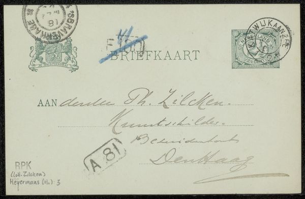
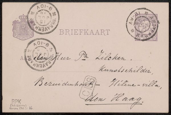
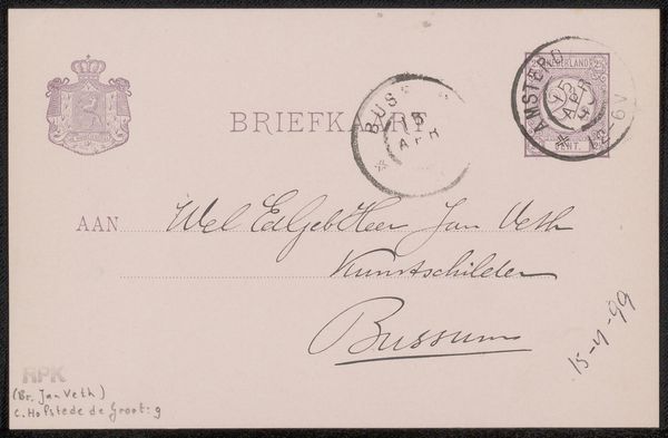
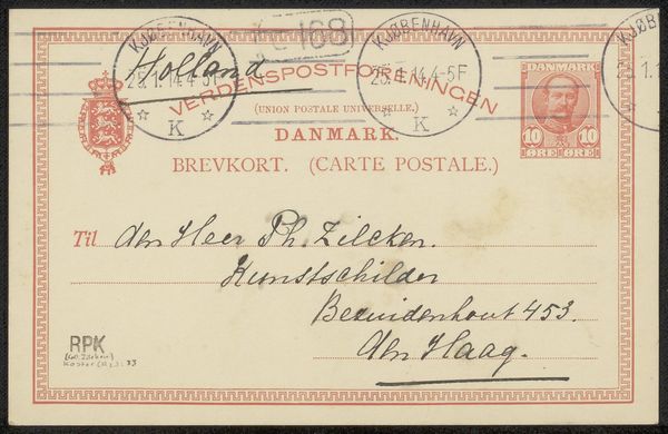
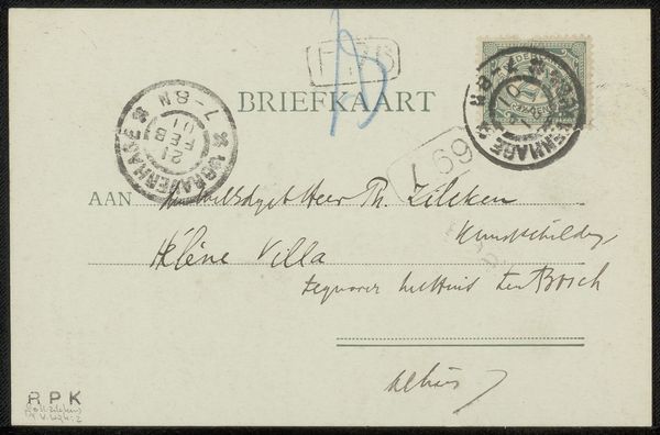
Briefkaart aan Pieter Haverkorn van Rijsewijk Possibly 1897
0:00
0:00
carelnicolaasstormvansgravesande
Rijksmuseum
drawing, mixed-media, print, paper, ink
#
drawing
#
mixed-media
# print
#
paper
#
ink
#
calligraphy
Copyright: Rijks Museum: Open Domain
Editor: Here we have a postcard, "Briefkaart aan Pieter Haverkorn van Rijsewijk," possibly from 1897, by Carel Nicolaas Storm van 's-Gravesande. It seems to be a mixed-media work using drawing, print, ink, and paper. I'm immediately drawn to the elegant script and the careful arrangement of stamps and postal marks. What strikes you about its formal qualities? Curator: The deliberate arrangement of text and postal markings generates an intriguing visual rhythm. Note how the artist contrasts the rigid grid of the printed postcard with the fluid lines of the handwriting and the circular stamps. This juxtaposition creates a dynamic tension across the picture plane. Do you observe the interplay between positive and negative space within the composition? Editor: Yes, the handwriting seems to dance around the structured print. And the cancellation marks almost become abstract shapes themselves, contrasting with the crisp typography. What about the limited palette? Does that inform our reading of the piece? Curator: Precisely. The restricted color scheme – primarily blacks, grays, and muted greens of the stamps – fosters a sense of unity. The calligraphy isn't merely conveying a message; it’s functioning as a crucial formal element, guiding the viewer's eye across the surface and adding layers of textural contrast. Notice how certain lines are bolder, others thin, creating a sculptural quality through pure line. How does this conscious manipulation of graphic elements inform your interpretation? Editor: It feels very deliberate and design-focused. The postcard transcends its functional purpose and becomes an exercise in visual balance. It's making me think about the relationship between utility and art. Curator: Indeed. And by focusing on these purely visual attributes, we reveal a fascinating dialogue between structure and expression inherent in everyday communication. Editor: I hadn't considered the interplay between form and function to be so deliberate, but now it really opens up new ways to appreciate something as simple as a postcard!
Comments
No comments
Be the first to comment and join the conversation on the ultimate creative platform.
More like this