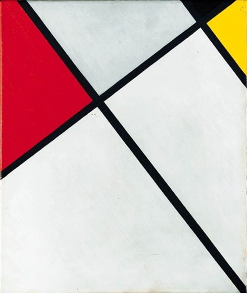
Contra-Composition of Dissonances, XVI 1925
0:00
0:00
theovandoesburg
Gemeentemuseum den Haag, Hague, Netherlands
painting, acrylic-paint
#
de-stijl
#
neo-plasticism
#
painting
#
pattern
#
acrylic-paint
#
form
#
geometric pattern
#
abstract pattern
#
minimal pattern
#
geometric
#
geometric-abstraction
#
abstraction
#
line
#
modernism
Dimensions: 180 x 100 cm
Copyright: Public domain
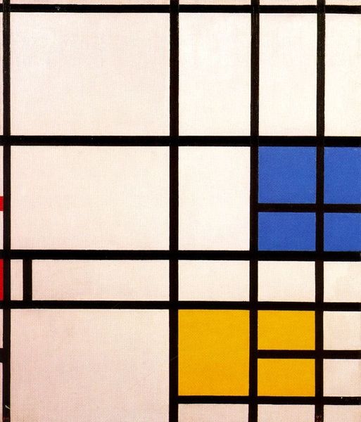
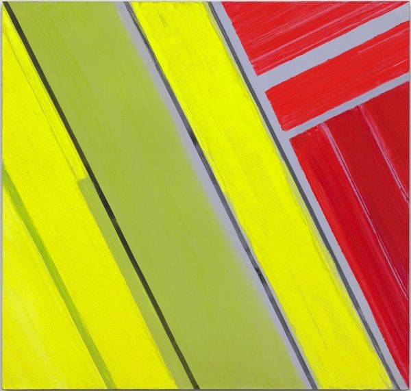
Theo van Doesburg made this painting, Contra-Composition of Dissonances, XVI, with oil on canvas. Look at the painting's surface. It’s smooth and precise, but there’s a subtle, almost handmade quality to it, as if the geometry has been coaxed into being. The colors here are so distinct, so contained. Each plane feels carefully considered, a testament to van Doesburg’s dedication to the process. Notice the black lines that grid the composition. They aren’t just boundaries, they vibrate and push against each other. There’s a tension, a visual dissonance that makes the painting so alive. If you trace one of the black lines with your eye, you can see it waver ever so slightly. This small imperfection is what brings the whole system alive. You can see the influence of Mondrian, but the added diagonals create dynamism and tension that feel utterly modern. Van Doesburg’s willingness to push against the grid creates a painting that's both structured and full of movement.
Comments
No comments
Be the first to comment and join the conversation on the ultimate creative platform.
More like this