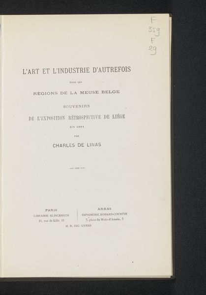
Eed van Aarts-bisschoppen bij de aanvaarding van hun ambt aan den Paus van Rome 1853
0:00
0:00
print, paper, typography
#
neoclacissism
# print
#
paper
#
typography
#
history-painting
Dimensions: height 23.8 cm, width 14.8 cm
Copyright: Rijks Museum: Open Domain
Editor: This printed document, from 1853, is titled "Oath of Archbishops upon Accepting Office to the Pope of Rome" by Gebr. Campagne. The typography and aged paper give it a certain weight. What do you see when you look at it? Curator: What strikes me is the relationship between the form and function. The symmetrical layout and classical typeface lend a sense of authority and tradition. Observe the hierarchy established by the font sizes. "Eed" is dominant, followed by the explanation below. How does that direct your reading of the print? Editor: I notice how the typography lends it a solemn feel. What about the use of negative space? Curator: The generous use of white space around the text amplifies its solemnity, don't you think? The crisp edges of the letters, combined with the aging paper, give us a sense of past, an object worthy of archiving and preserving. It embodies a neoclassical aesthetic through order and clarity of design. Are you able to identify further how meaning and structure interact? Editor: It’s interesting how the design emphasizes the importance of the text, it also creates a historical experience through these formal structures. It reminds the reader, including me, that the historical event is preserved through typography, language, and the passing of time. Curator: Precisely. This print successfully uses formal elements to convey power, permanence, and the weight of tradition.
Comments
No comments
Be the first to comment and join the conversation on the ultimate creative platform.
More like this