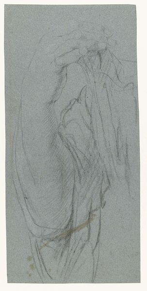
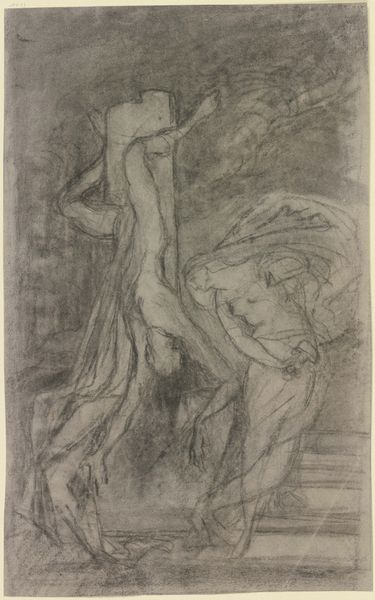
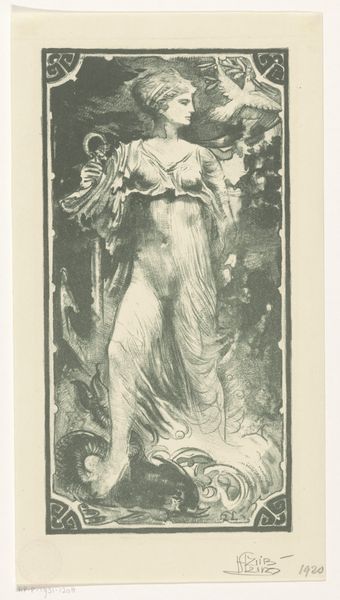
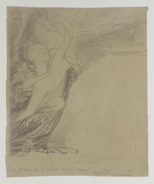
Deel van de omslag van het programma van de 'Uitvoering van Nederlandsche liederen uit het Liederboek voor Groot-Nederland' 1899 - 1901
0:00
0:00
jantoorop
Rijksmuseum
drawing, paper, pencil
#
portrait
#
drawing
#
toned paper
#
figuration
#
paper
#
pastel chalk drawing
#
pencil
#
line
#
symbolism
Dimensions: height 230 mm, width 131 mm
Copyright: Rijks Museum: Open Domain
Curator: The "Deel van de omslag van het programma van de 'Uitvoering van Nederlandsche liederen uit het Liederboek voor Groot-Nederland'," dating from 1899 to 1901, immediately strikes me with its ethereal quality. The delicate lines and monochrome palette create a sense of quiet contemplation. Editor: It’s interesting how the medium--pastel chalk and pencil on toned paper--affects our perception. Given that it was designed as part of a program cover, what can we say about its production context, or indeed about "Liederboek voor Groot-Nederland"? Curator: The material choice gives the artwork an almost dreamlike haziness. This would fit perfectly within the broader cultural movements and intellectual climate towards the fin de siecle that saw an increasing fascination with Symbolism as evidenced by the ethereal treatment and heightened expression. Editor: Symbolism absolutely, but let’s not overlook the overt nationalism in this songbook. We see art being directly integrated into a very specific cultural project, emphasizing shared Dutch heritage. The production and dissemination of these songs was clearly intended to bolster a specific cultural identity. How does Toorop’s piece speak to that? Curator: Notice the figure's upward gaze and open stance, seemingly in reverie or song. Her flowing garment and loose hair speak to an embrace of freedom and movement—which, one could argue, reflects a symbolic narrative of cultural and spiritual ascension, and a freedom found in connecting with 'Dutch heritage,' or even ‘Groot-Nederland.’ Editor: The toned paper, then, wasn’t merely an aesthetic choice; it likely impacted cost and reproduction. Printing technologies of the time would have played a role. And that rather simple composition using chalk and pencil makes it easily reproducible to mass distribution for concert goers. It is no grand masterpiece meant to simply be hung in a gallery for observation. It serves a very materialist purpose for that time and place. Curator: But look closely again, notice how Toorop uses the bare minimum to still trigger certain artistic cues, focusing on how he treats light and texture. Isn't the woman depicted far more engrossing than any overt political signal? Editor: Toorop certainly created a compelling image, and its beauty draws you in. But understanding how it was made, its original purpose, its relation to material culture of the time gives an alternate narrative. For me it underscores how intertwined aesthetics are with social realities. Curator: Perhaps, it reveals to us how subjective beauty is in reality. Thanks for revealing the layers behind this beautiful piece!
Comments
No comments
Be the first to comment and join the conversation on the ultimate creative platform.
More like this