drawing, paper, ink, graphite
#
drawing
#
dutch-golden-age
#
paper
#
ink
#
graphite
#
calligraphy
Copyright: Rijks Museum: Open Domain
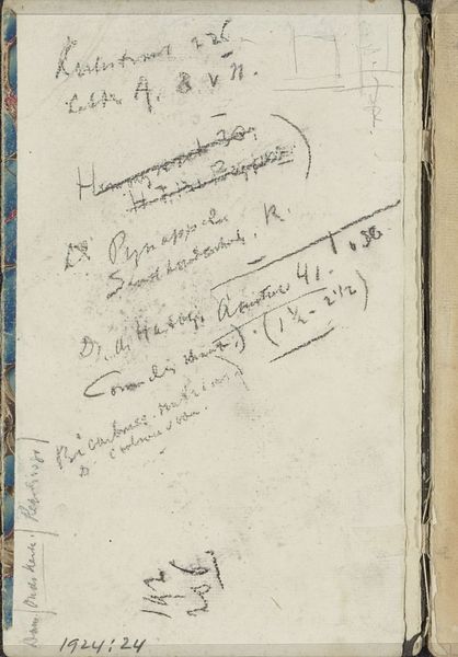
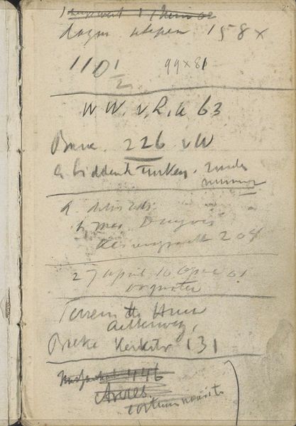
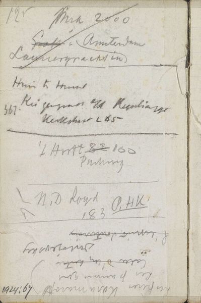
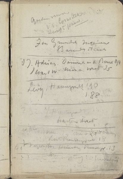
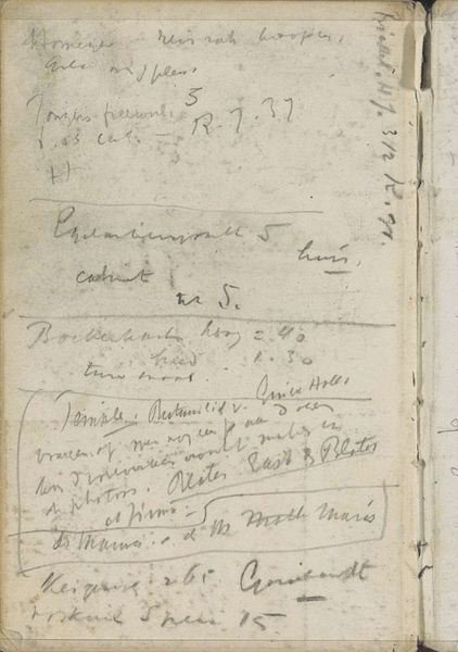
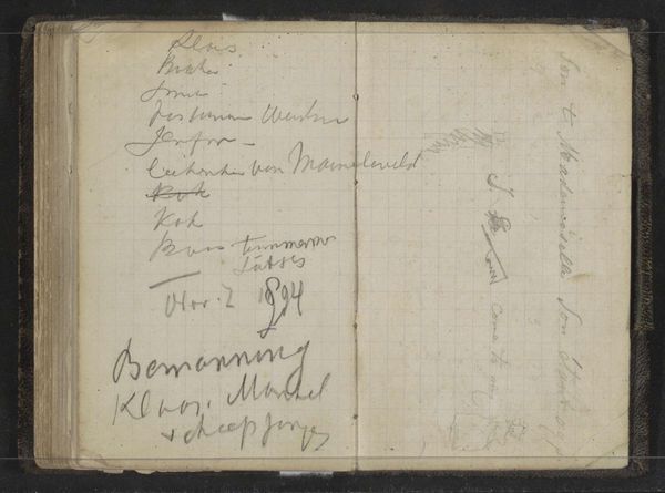
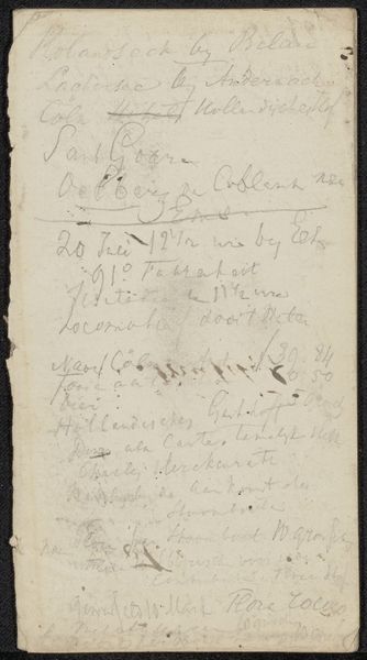
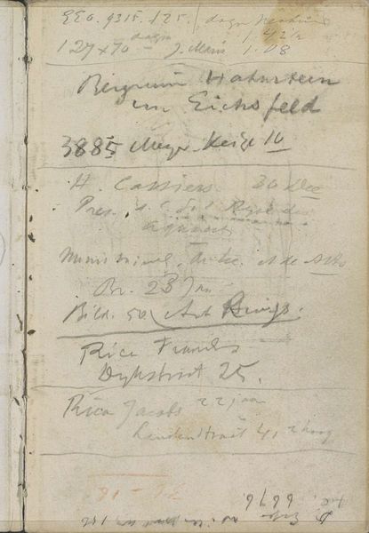
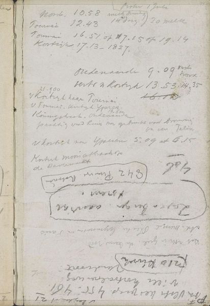
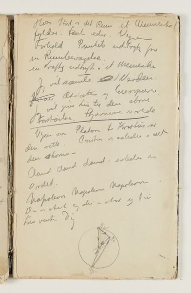
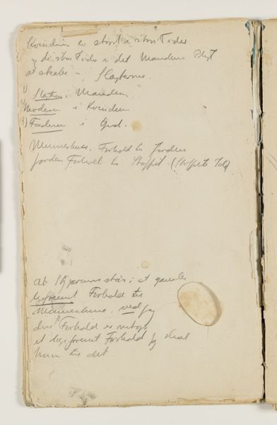
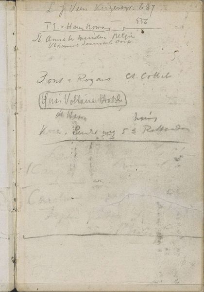
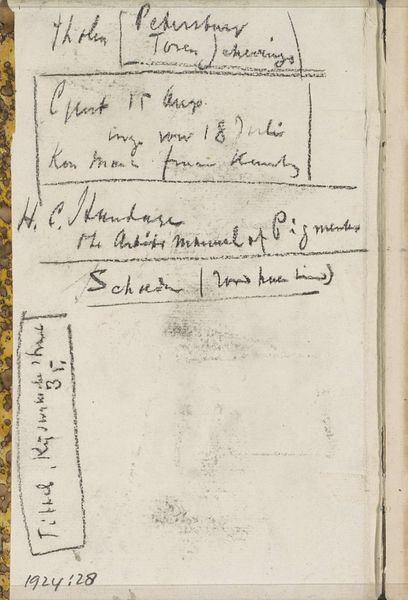
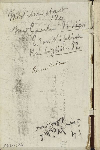
Editor: Here we have Breitner’s "Annotaties," a drawing in ink and graphite on paper, created between 1884 and 1886. It strikes me as chaotic, almost like a page ripped from a madman’s notebook. All those scrawled annotations… what do you see in it? Curator: What commands my attention is not chaos, but controlled energy. Note how Breitner distributes the graphic weight. The density of script at the top creates a visual mass countered by lighter strokes towards the bottom, preventing the composition from feeling top-heavy. Do you perceive that the artist repeats shapes to weave everything together? Editor: I hadn’t considered the balance… I was too busy trying to decipher the text! Are the recurring shapes the diagonal strokes that form the ascenders and descenders of the lettering? Curator: Precisely. Consider also how the varied pressure of the graphite lends a dynamic quality. Observe the interplay of thick, assertive lines versus the fleeting, ephemeral ones. It’s a structured dance, not mere frenzy. Editor: So you are suggesting that even in what seems like disorder, there’s a conscious structuring of visual elements…that Breitner is using calligraphy itself as a visual language rather than as pure transcription? Curator: Indeed. The materiality of the paper, the ink, the graphite, are combined in specific arrangement, and thus we engage with the image's internal coherence, a logic independent of legible textual content. Do you agree with that? Editor: I see it now. Looking at it this way has given me a fresh appreciation for what might initially appear as simply haphazard scribbling. The structural logic within the composition makes it far more deliberate and considered. Curator: It invites us to delve deeper, finding purpose in what appears random. A most enriching discovery.
Comments
No comments
Be the first to comment and join the conversation on the ultimate creative platform.
More like this