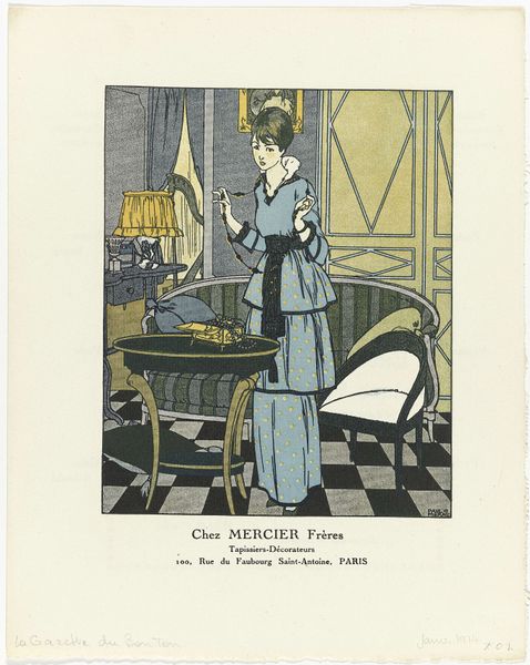
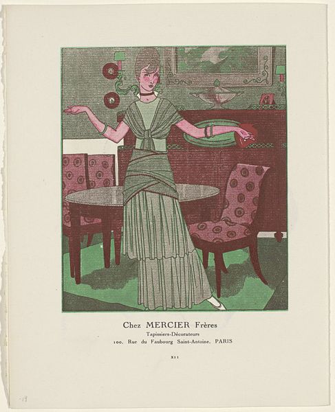
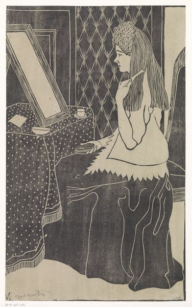
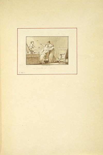
Gazette du Bon Ton, 1915 - No. 8-9: Advertentie 'Chez Mercier Frères", Tapissiers-Décorateurs 1914
drawing, print, ink, pen
drawing
comic strip sketch
art-nouveau
pale palette
old engraving style
figuration
personal sketchbook
ink
ink drawing experimentation
pen-ink sketch
pen work
sketchbook drawing
pen
storyboard and sketchbook work
decorative-art
sketchbook art
Dimensions: height 246 mm, width 377 mm
Copyright: Rijks Museum: Open Domain
Editor: This is a print titled *Gazette du Bon Ton, 1915 - No. 8-9: Advertentie 'Chez Mercier Frères', Tapissiers-Décorateurs*, created in 1914 by Maurice Taquoy. The color palette and delicate line work evoke a feeling of restrained elegance. It has a sense of fashion illustration blended with a hint of domesticity. What kind of symbols and deeper meanings do you find in this advertisement? Curator: I see an entire narrative woven into the imagery of this advertisement. The figure, presumably a client, holding flowers, becomes symbolic. The flowers and the space 'Chez Mercier Frères' offer not merely decoration, but the promise of an elevated lifestyle. Does the setting speak to a broader aspiration of Parisian bourgeois culture at that time? Editor: That’s interesting. I hadn't considered the lifestyle element so directly. Do you think the somewhat muted colors play a role in creating that impression? Curator: Absolutely. The palette speaks volumes. The limited color range hints at sophistication and restraint, qualities desired during a period marked by both opulence and anxieties surrounding social status, but does the chair in the foreground elicit something specific to your experience? Editor: It makes me think about how the domestic sphere became a canvas for expressing identity, especially for women. The fabrics, the furniture... all communicating something. It's less about function, more about… representation. Curator: Precisely! Each element is laden with symbolic weight, reflecting personal aspirations and broader cultural values. It all reminds us that even a seemingly simple advertisement is capable of speaking volumes. Editor: I never really looked at advertisements in terms of their symbolism. It really makes me look at these types of illustrations through an anthropological lens. Thank you.
Comments
No comments
Be the first to comment and join the conversation on the ultimate creative platform.
More like this